


UI Designer
Sketch, Principle, Framer X, Keynote
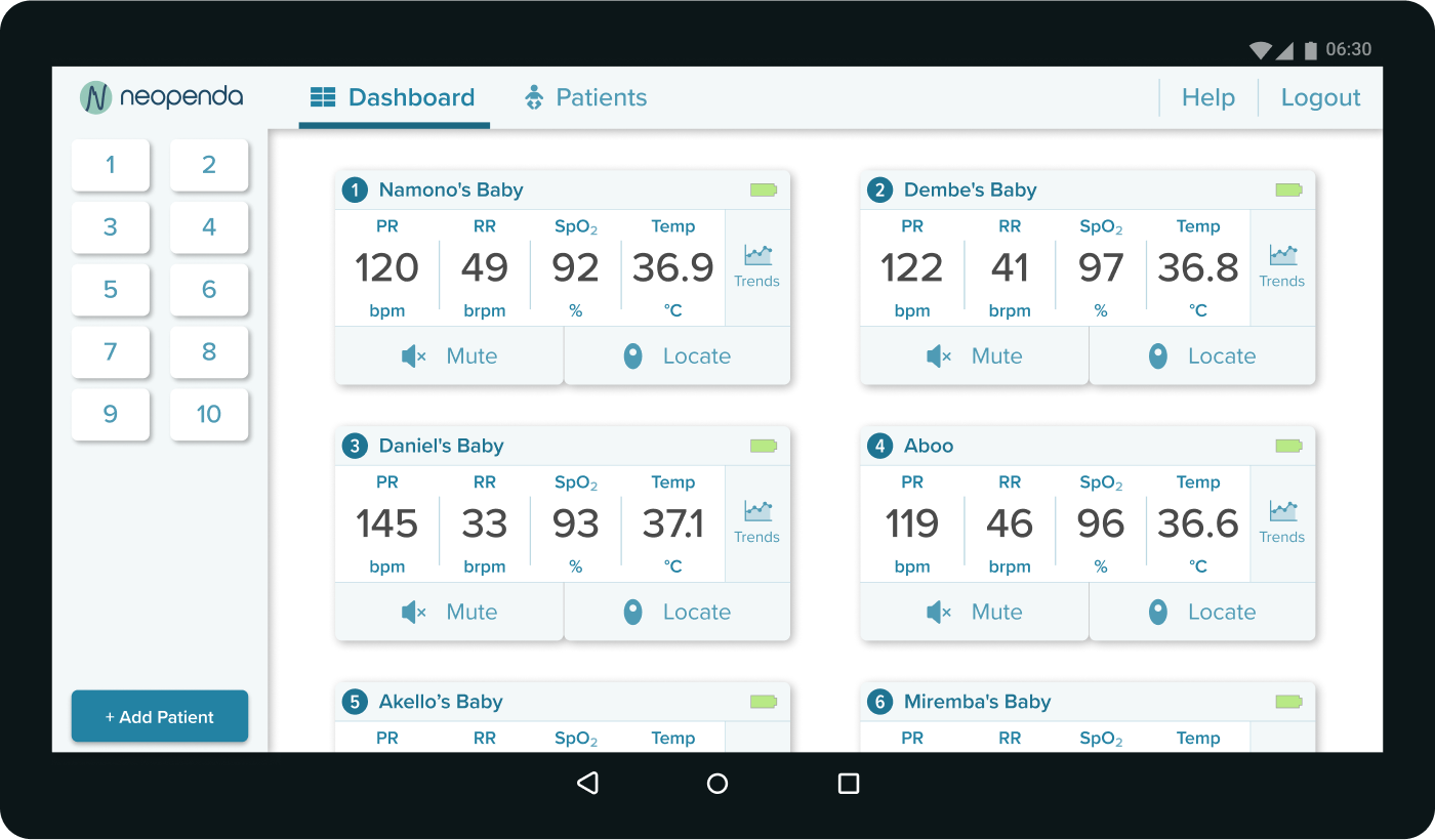
Neopenda is a biotech startup that aims to provide low-cost medical solutions for patients and medical professionals in developing countries. In this project, I designed an Android tablet app for busy Ugandan NICU nurses by significantly reducing the time required for the nurses to measure the vitals of babies in the NICU.
The babies need help, and so do the nurses.
Each year, nearly 2.5 million babies die from preventable conditions in developing countries, partially because of poor resources in health facilities. Nurses in these countries, including Uganda, are heavily overwhelmed by the tremendous workload.
To address this issue, a UX team had previously worked with neopenda and developed a wireframe solution for these nurses. My goal as a UI designer was to evaluate the wireframes and improve the usability of the app for Ugandan nurses.


My teammate and I kicked off the project with the co-founder, Tess, who developed the vital device that will be paired with the app.
The key takeaways are:
Consider the alarm fatigue. Multiple alarms going off at the same time may be common in users’ working environment.
Our users are overwhelmed by their day-to-day work. This app should make their lives easier without adding any learning curve or workload.
We also came up with three design principles based on the initial research and project requirements.
Put the most important and pressing information in the most visible and prominent locations, expressing a clear hierarchy, ensuring color contrast accessibility, and reducing decision fatigue.
Our dashboard should make important information easily visible at a glance.
Use familiar patterns, language, and conventions that require minimal learning curves, assumptions, or onboarding to understand.

My team and I conducted a visual competitive analysis to evaluate the strengths and shortcomings of five competitors. The key takeaways are:
Traditional vital machines tend to have a dark interface to create contrasting colors for important information.
Large, visible, sans-serif fonts are commonly used to ensure readability from a distance.
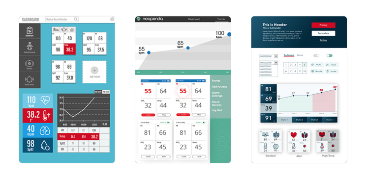
In order to get an idea of what our users like in terms of design style, I prepared 3 style tiles in dark, light, and mixed mode. All the style tiles are in portrait mode to accommodate the desirability tests (more details later in the case study).
I created a light-mode design to distinguish our app from the traditional vital machines. The layout of the cards makes users easier to scan across. In addition, I used red and blue to show the out-of-range vital signs: red means higher, and blue means lower than the standards.
This dark-mode design is closer to conventional vital machines. Instead of red, I used magenta as the alert color to spice up the design and make the interface look modern. At the same time, it doesn't cause anxiety or alarm fatigue compared to red as the alert color.
I included some crazy ideas in this design to try to push the boundaries of the app. This dark- and light- combo design has icons to represent vitals. The idea is to reduce users' stress through playful design.
As for the trends, I filled in colors and textures to the graph so that users can easily find the information on the x-axis.
In total, my teammates and I created 12 style tiles. To make the test easier for the users, we used an approach called triading, where we showed three randomized style tiles at a time for four rounds. Each user was tested with randomized style tiles to minimize the bias. We asked questions like, "Which tiles do you like and dislike the most?" and "Why do you like/dislike it? " Through this method, we were able to know what our users like and dislike and what works the best among different design strategies.
The image below is an example round of triading.
We recruited 3 Ugandan users, with the help of our client, and 4 US nurses, from our connections. All interviews were done remotely.
Dark and light modes were equally loved.
The color usage of "The Day" and "The Dawn" were more popular than "The Night" because of the color contrast and visual hierarchy. Some users also mentioned that it's not a good idea to use colors other than red to show emergency.
Dark interface is easy to the eye; especially during the night shift.
Light interface keeps me awake during the night shift.
Some users said that it is easier to scan the numbers when the vital signs are horizontally aligned because they can compare the readings vertically.
Many users mentioned that the vital readings should be seen from afar and should be the most important information on the screen.
It’s easier for me to scan across the readings than to view vitals in a square.
The icons are huge. I can’t even see the numbers.
The trend graphs must include units for the x- and y-axis.
Most users like the trend graph on "The Dawn" because the fill-in graph design helped them quickly read the x-axis. The texture also makes the critical events look more prominent.
What are the units of the x-axis and y-axis? I need them to read the graph.
It’s easier to tell what time it is for each dot with the fill-in graph.
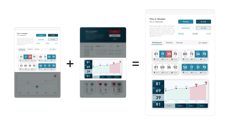
Based on the desirability test, I decided to move forward with the combination of "The Day" and "The Dawn." Users found it easy to digest the information on "The Day" and they could quickly comprehend the data shown on the graph on "The Dawn".
The combination aligns with our design principles. The enhanced visual hierarchy helps users quickly track down the most important information (Inverted the pyramid). The new layout of the vital cards allows users to scan across the vital signs (Bird's eye view). Finally, the conventional UI elements used for the design are familiar to our users (Don’t reinvent the wheel).
Before working on high-fidelity mockups, I evaluated the wireframes based on our research to further iterate the UX design and improve usability.
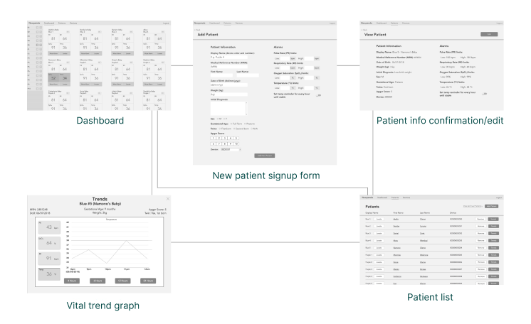
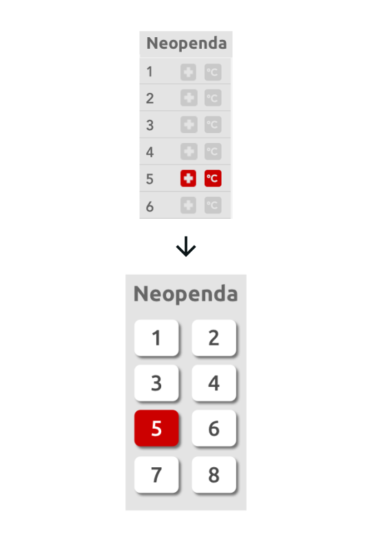
I made changes to the following elements:
The goals of the side panel are 1) to quickly inform users about anything urgent and 2) to help quickly jump to the corresponding patient vital card. However, the original wireframes only partially achieved the goals because 1) the buttons were too small for big fingers and 2) the vital icons were confusing and redundant to alert users to emergency events.
To solve the issues, I replaced the icons with big buttons with numbers. Each number represents a patient on the list. Additionally, I simplified the alert system by making the button flash red when the corresponding patient's vital signs are off.
By doing so, we don't need to worry about fat finger issues and alarm fatigue.
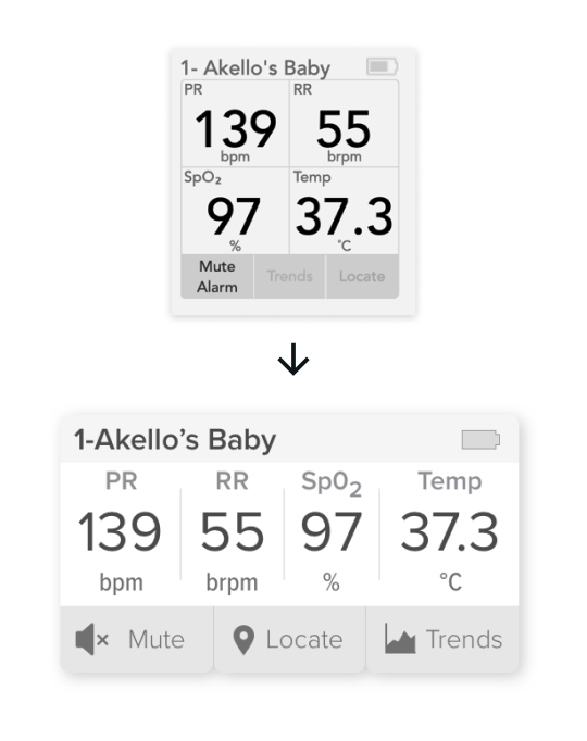
The vital cards provide real-time vital sign readings. However, the layout was ineffective for our users because the users had to read the card in a Zigzag pattern or circle.
To improve legibility and effectiveness, I redesigned the vital cards and made all the readings displayed horizontally.
According to our users, this layout helped them scan across the numbers quickly and allowed them to easily compare the vital signs with other cards in the same column.
The users can add new babies to the system through the new patient signup form. The original form was hard to digest, and users needed to input the same numbers every time for the "Alarm Limits" section.
To reduce the workload, I separated the form into three steps based on the input methods. By doing so, the users don't need to switch around input methods to fill the form. Additionally, for the "alarm limits" section, all the form fields were pre-filled with standard numbers. Users can proceed to the next page without editing unless there's a special need.
I created high-fidelity mockups of the key screens — the dashboard in the resting state, the dashboard in the alert state, and the trend graph — and reviewed remotely with 2 Ugandan nurses, 1 US doctor, and 2 US nurses to get more insights on the refined design direction.
The dashboard is where users can have a glance at patients' vitals. When any critical events occur, the buttons on the side panel and the vital signs of the corresponding patient flash red, notifying the users about the situation.
Users knew how the side panel worked instantly.
Users thought the design was too white in the resting state, yet they noticed a strong contrast in the alert state.
Our users mentioned that the red color was not “dangerous” enough in the alert state.
Some users thought that the numbers look very crowded and hard to read.
I added some colors to the interface to make the UI not that white while keeping the high contrast.
I made the red more vibrant to show urgency.
I made the vital cards larger, giving the numbers more breathing room.
I relocated the buttons based on the frequency of use during the user testing.
The trend graph helps users track down medical events. It is also a tool to communicate with other users during shift transition.
The fill-in colors helped users track back to the x-axis(time).
The graph was too small.
Users wanted to see the standard range of each vital, detailed time of critical events, and the date, which helps them better communicate during work shift transition.
I kept iterating on the feedback and created more screens for the remote usability testing with 5 US medical professionals. I asked the users to complete a task flow (as shown in the image below) within a given scenario.

I used Framer X and Principle to create prototypes for user testing and deliverables because of the different properties of the tools. Here's an example of a prototype using Framer X for user testing.
After a few quick fixes based on the feedback from the usability testing, here's the final product reveal:
The dashboard displays all the vital cards of connected vital monitors. The side panel gives an overview of the current status of babies. If something goes wrong, the button of the corresponding baby will turn red. Users can tap the button, which will bring them (auto-scroll) to the vital cards of the baby with out-of-range vitals.

By hitting the "Add Patient" button, users are prompted to the 3-step form. Each step has a similar way to input data to speed up the data input process.
In step 3, alarm limits, all the form fields were pre-filled with standard ranges so that users don't need to fill in the same numbers every time unless they want a customized range. If users change anything on the alarm limits form, a pop-up will ask them if the changes were made intentionally. By doing so, we can minimize human errors.
After completing the form, users can quickly scan through the information and make changes to the individual step if needed. Once users hit the confirm button, they're brought to the patient list page, where they can see the newly added patient highlighted and other patients on the list.

I introduced the notification system to the design. When the users are not on the dashboard screen, a big red pop-up notification bar slides from the right to notify users if there's a new emergency event. Users can tap the notification bar to view the vital card on the dashboard.

Users can view the trend graph and event history on the "Trend" screen.
On the graph, the red-shaded area shows the length of the critical event. Users can tap the symbol to view more details about the event. They can also view the graph in different increments or durations by switching the toggles and buttons on the left.

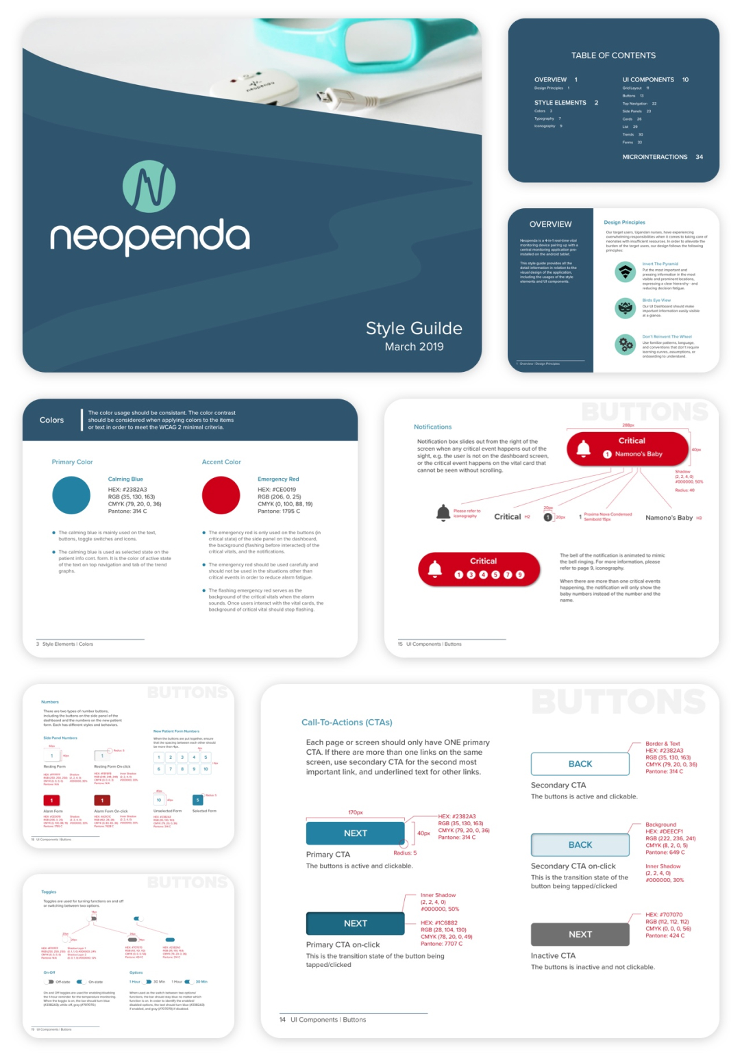
I created a style guide for future designers and developers to ensure brand consistency as the app grows.
The mute button temporarily stops the app's sound. Users can use the button after the baby has been treated. However, not all the treatments take the same amount of time to work. Therefore, an advanced mute function is needed for users to choose a specific timeline based on the treatments.
Future developers or designers need to figure out how to make sure that the mute button is used only after the users have checked the baby in need.
The new patient form was created based on the US standard. It needs to be updated based on the Uganda healthcare system.
We need to make the app customizable. Users should be able to edit the preset alarm limits, the length of the mute, and colors for accessibility, etc.
This project means a lot to me. I got to not only advance my design skills but also make an impact on this world.
In this project, I created a visual system to help users adapt to the interface with a minimal learning curve and provided a style guideline for future designers and developers to expand the app without drifting away from the brand.
Of course, I could have done a better job if I had more time for the project. For example, we could have recruited more Ugandan nurses for more accurate data. The reason we didn't get enough target users was that we did not expect that setting up a remote meeting with people from other countries would take that long. I had learned my lesson. Next time, if I had a chance, I would leave more time to recruit target users.
It was a great experience working with the client and my teammates. I'm proud that through this project, I would potentially save millions of lives in Uganda.