


UI Designer
Sketch, Principle, Illustrator, Keynote
Stride 360 is a 2-in-1 bike/elliptical fitness machine that comes with a mobile app that can control the bike/elliptical and track users' workout activities. In this project, I designed an iOS mobile interface, a logo, and a mobile-first marketing site.
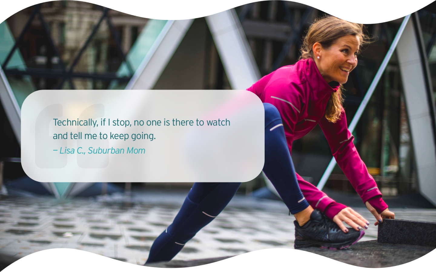
The suburban moms can’t stick to the exercise habit.
Our target users are suburban moms who were in their 40s-60s. In the user interviews, we found that our target users struggled to exercise regularly and couldn't handle intense exercises. Therefore, the goal is to help our users stay active and motivated with low-impact workouts.

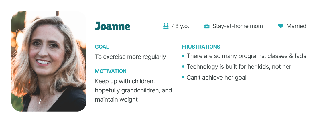
Meet Joanne, the casual fitness mom
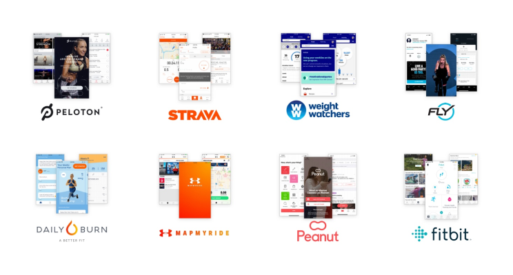
My teammate and I conducted a visual competitive analysis to understand our competitors, including Fitbit, WeightWatchers, Fly, Peloton, MapMyRide, Strava, and Daily Burn HIIT. We also looked into Peanut for design inspiration.
The key takeaways are:
The informal and casual language, colors, and custom illustrations make the interface more friendly and supportive.
A dark interface, ideal body image, and limited use of colors create high-end, high-intensity, and exclusive vibes.
Based on the SME interview and initial research, we're creating a friendly and intuitive product to motivate our target users based on the following design principles.
Research shows that competition doesn't motivate our users. For this reason, we will utilize supportive content and microinteractions to delight our users and promote consistent engagement with this application.
Our users are not tech-savvy. By using familiar UI patterns, concise copy, and clear affordance, we want to design an interface that our users can easily navigate.
Stride 360 is inclusive of all ages, sizes, and fitness levels. For this reason, our designs will also be inclusive by utilizing realistic imagery, as opposed to only showing the idealized body shape.
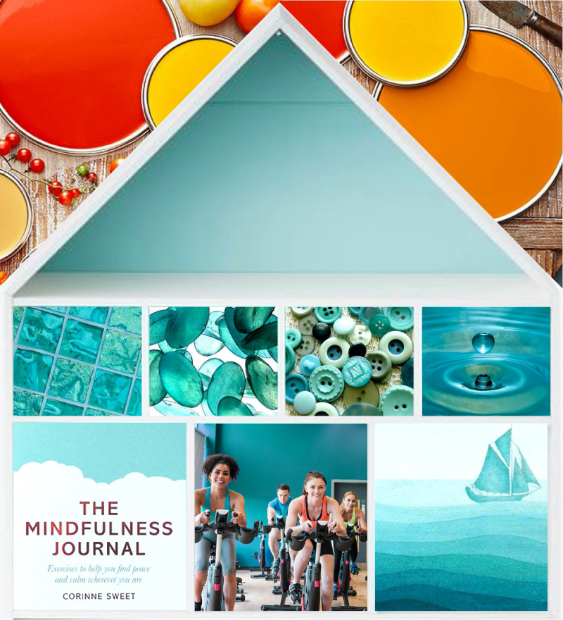
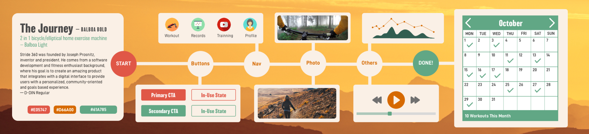
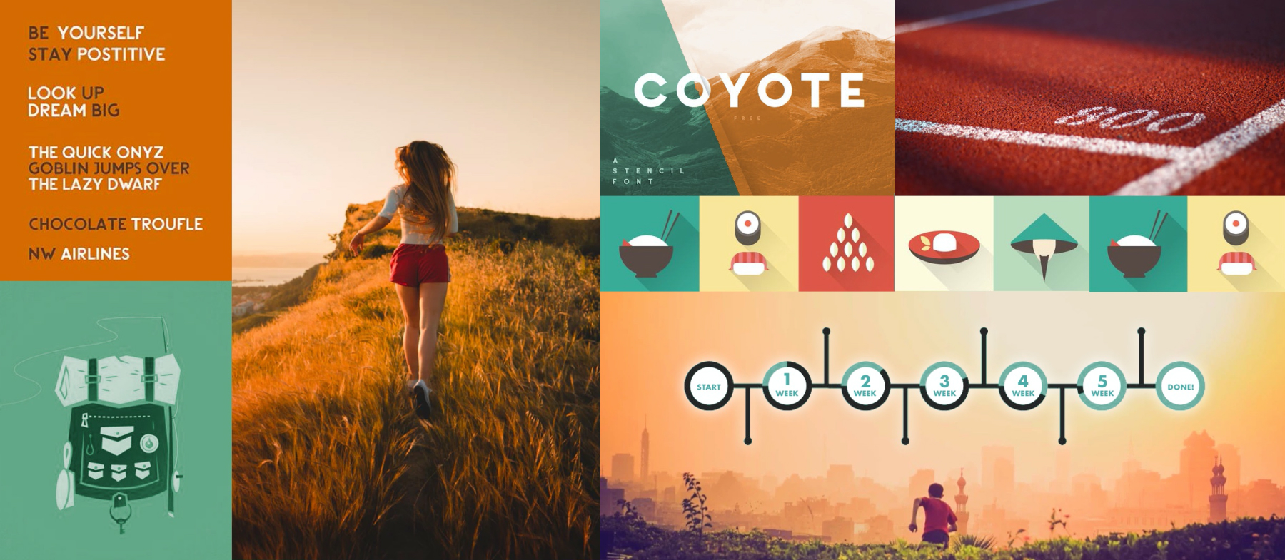
To create an interface that meets the brand values and user preferences, I explored three concepts: The Journey, The Support, and The Home. I started with moodboarding, followed by building style tiles based on the moodboards I created. (Click to view larger images)
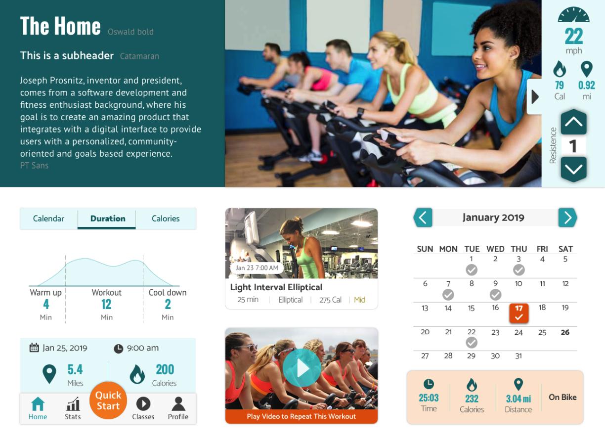
I used aqua as the primary color to create a calming interface and orange as the CTA color to draw users' attention. The rounded corners and community-oriented images make the design approachable. I also used home-shaped buttons to carry out the idea of home.
This design is my final direction because it meets user needs and the brand values the most.
This design was inspired by "fitness as a journey." The color combination, illustrations, and the use of the timeline make the design look friendly and motivating. I also use single-person photos to show that this fitness journey is personal.
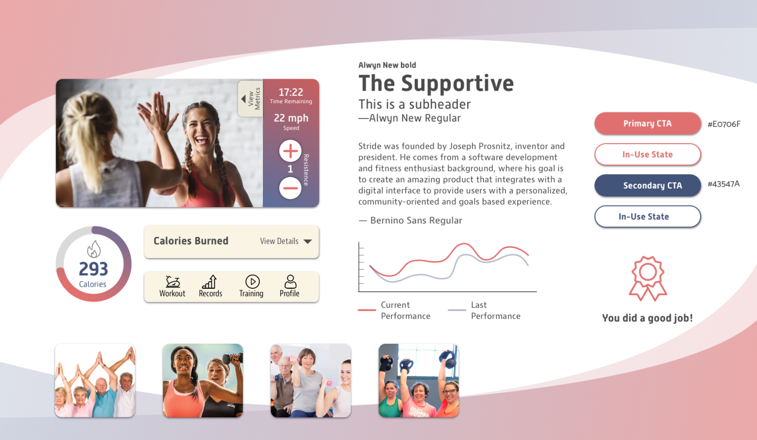
A support system helps our users keep their exercise habits. I used warmer colors and encouraging imagery to motivate our users. The rounded corners and gradient also make the design more friendly and approachable.

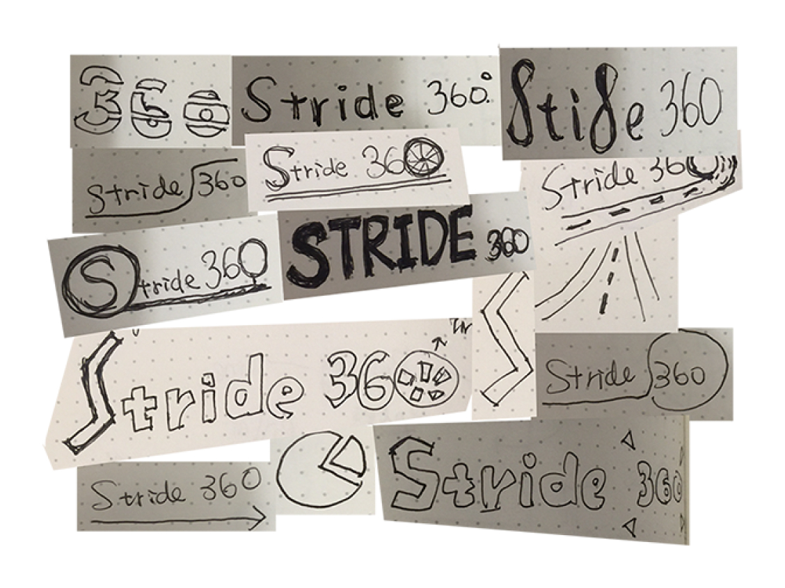
I sketched up as many ideas as possible to get started with the logo design process. I then picked a few concepts and digitalized them for feedback.
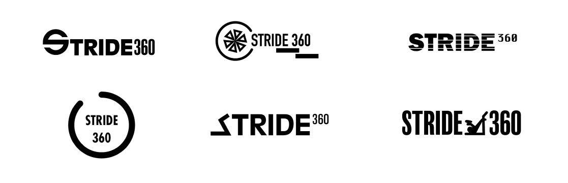
I kept iterating until they were polished.
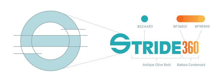
Finally, the following logo was chosen.
The circular "S" represents the wheels of the machine. We can use the "s" to create the spinning animation to motivate our users to keep spinning and moving on their fitness journey.
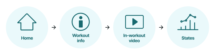
I evaluated the wireframes created by the UX team and further iterated the design to improve usability. The main changes I made are as follows.
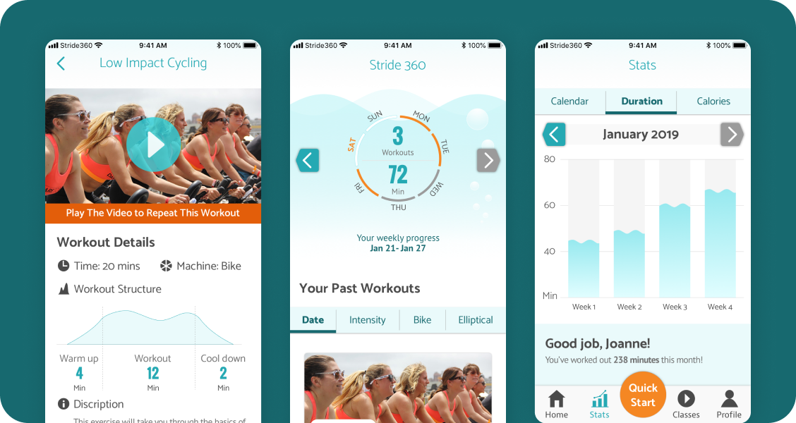
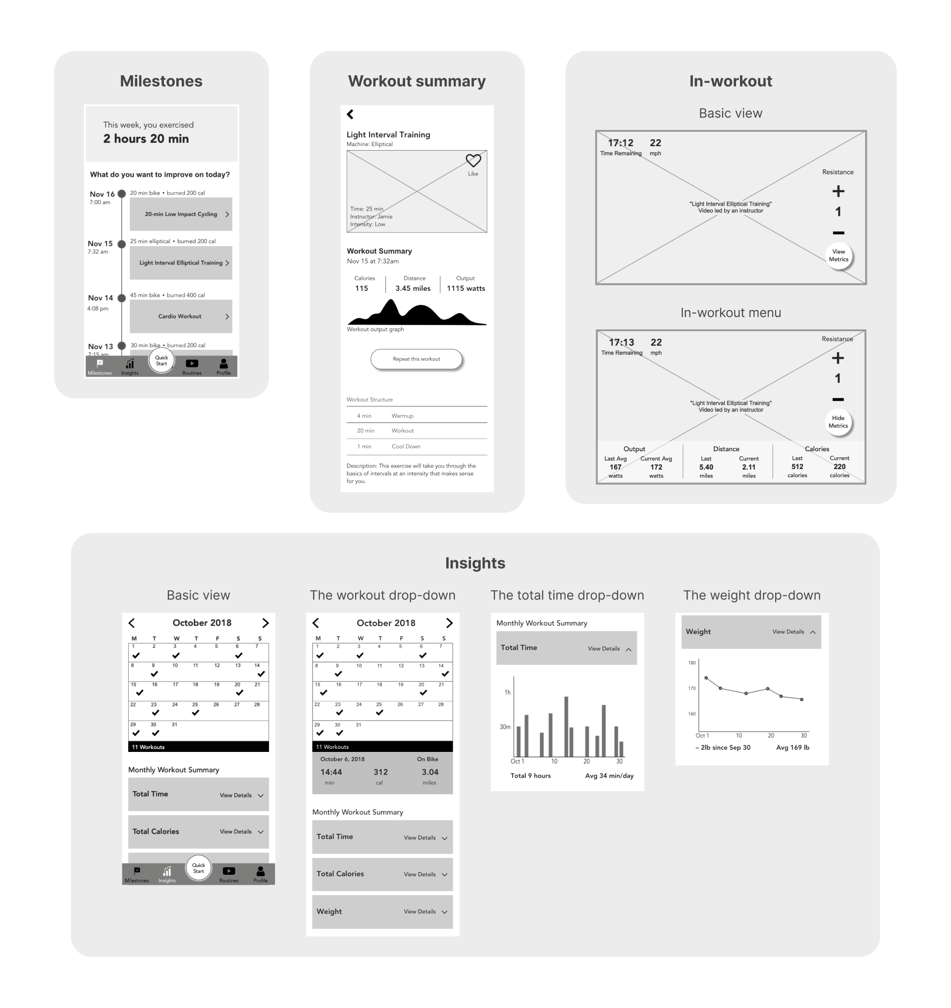
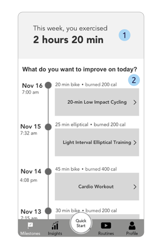
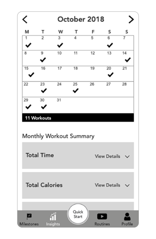
The home screen includes an overview of the weekly exercise and past workouts. The weekly overview encourages users to exercise more. The past workouts show the workout history. Users can repeat previous workout sessions from there.
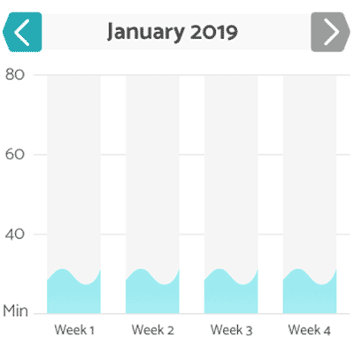
The original design shows the accumulated workout time during the week to encourage users what they've achieved. However, it is not visually motivating to our users.
The information hierarchy needs to be improved. For example, the date was too prominent on this screen; however, it's not the most important information here.
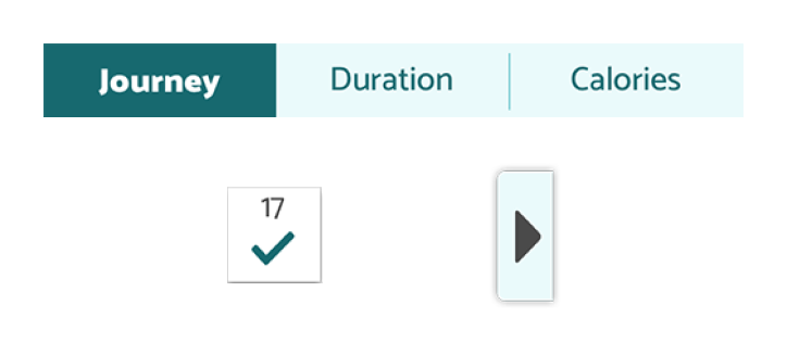
I created a workout wheel showing the accumulated time and daily check-ins to motivate users to exercise more.
I enhanced the information hierarchy by updating the layout of the screen.
I added a filter to help users quickly find the workout sessions.
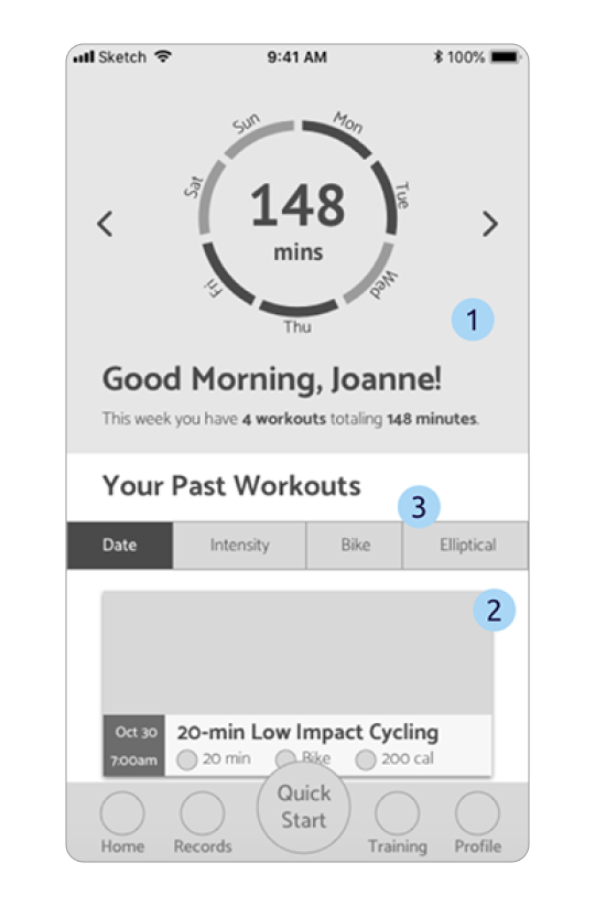
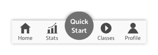
The bottom navigation guides users to four main screens:
In the original design, milestones is the landing screen where users can view the workout overview and workout history. Insights shows the workout data, including calories burned, workout duration, and workout dates. Routines provide workout training videos. Profile shows the user profile as well as settings.
The icons and labels were not conventional, which may confuse users when using the app.
I updated the icons and labels to match the goal of each screen, which helps users navigate through the app.
On this screen, users can view details of the workout. The screen includes a workout preview video, workout summary, and users' past performance with this workout.
The text over the video may be illegible if the video and the text do not have enough contrast.
"Output" was not commonly known by the users.
This button should always be visible according to the UX team. However, different device sizes and page lengths may make the button below the fold.
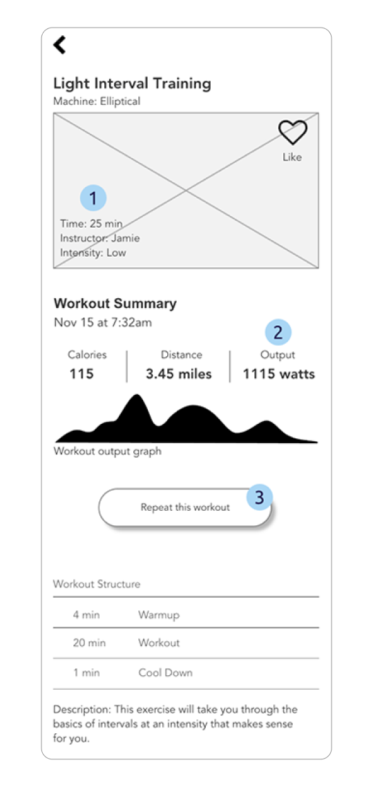
I created the workout details section to accommodate the workout information that was previously on the preview video.
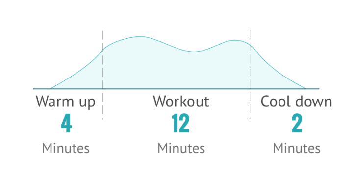
I added more details to the workout structure so that the users can anticipate what is happening during the workout.
I removed output and kept distance and calories.
I added a play button to the video and made the video sticky. The video is always above the fold. Users can start the workout by playing the video.
Users can follow the in-workout video during their daily routine with the Stride 360 machine. They can track their workout metrics and control the machine at the same time.
The metrics and control options over the video took up too much space. It can be hard to watch the video on the phone.
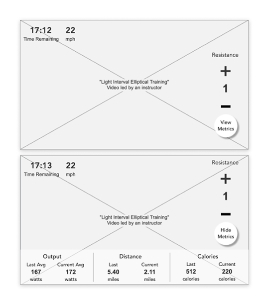
I created a retractable side panel to include all the metrics and the resistance control. Users can tap a button to view the panel whenever they want.
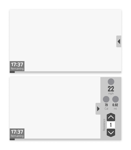
Users can follow the in-workout video for daily routine with the Stride 360 machine. They can also track their workout metrics and control the machine.
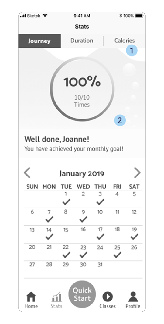
The UX team incorporated all the stats into one screen. The data presentation can be overwhelming when viewing all the information on the same screen.
I added tabs at the top for users to switch among different stats.
I created an overview wheel for each tab to motivate users to complete their monthly goals.
I created some microinteractions to delight our users during their fitness journey.
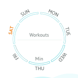
I created this wheel to provide an overview of the weekly workout and to motivate users to keep their exercise routine. Once users enter this screen, the wheel lights up in orange if users worked out on the day; or in gray, if not.
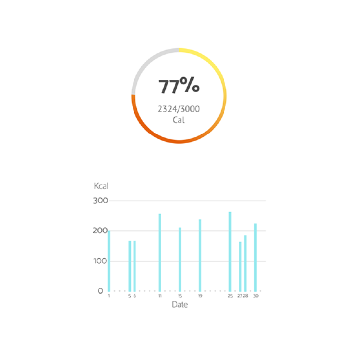
On the stats screens, I used the image of water and tubes to encourage users to fill up the bars by working out more regularly.
The countdown screen pops up after users hit the play button on the training videos. It gives time to users to step on the bike and be ready for the exercise.
For the usability testing, we remotely talked to 4 suburban moms aged from the 40s to 60s who had iPhones. We asked them to complete the following task flow.
Our users thought the colors were pleasant to the eye.

Our users liked the workout structure on the workout info screen because they could tell what to expect during the workout.
Our users thought the text on the phone was big enough for them to read when they were in motion.
Users couldn't notice some buttons, including the tabs, calendar checkmarks, and the call-out button for the in-workout side panel.
To fix the issues, I added some microinteractions to make the buttons more noticeable.
TThe wheel was supposed to motivate our users; however, our users were annoyed to scroll up and down to see the information they needed.
As for the graphs, the numbers were almost illegible on a small screen.
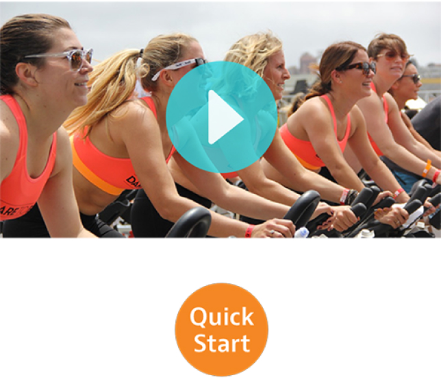
On the workout info screen, users start a workout by tapping the play button on the video. However, many users tap the quick-start button instead.
We can either make "quick start" work as the play button or add a tutorial to clarify that the two buttons worked differently.
I made the following walkthrough with Principle, the prototyping tool, to create motivating animations that encourage our target to stay active.
Joanne has been using the Stride 360 app for a few months. Today, she opened the Stride 360 app and was greeted by the splash screen. She felt a sense of achievement and satisfaction when she saw she had worked out three days this week. She can't wait to start her workout of the day.

On the home screen, Joanne browsed through the workouts she had done over the past few days. She checked out the detailed information of the workout and decided to improve on the Low Impact Cycling.

Joanne hit the play button and rode on her Stride 360 bike before the countdown ended. She saw a side panel on the screen slide out of sight when the training video started. Joanne called out the side panel by tapping the button on the right to see her workout metrics and to control the resistance of the bike.
After finishing the workout, the app brought her back to the home screen, where Joanne saw the updates of the overview wheel.

Joanne wanted to see her workout performance of the day. She went to "Stats" to view her workout details. She also checked out her calories burnt and workout duration of the month and was satisfied with her improvements over the past few weeks. Now, Joanne is a happy and healthy mom because of Stride 360.

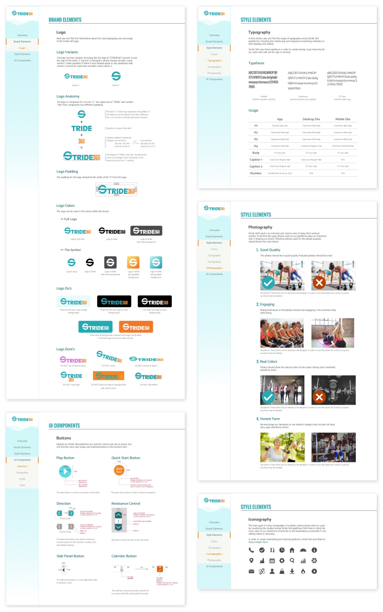
It's important to stay on-brand when developing the app. For this reason, I created a style guide to ensure that future designers and developers follow the branding while developing the Stride 360 application.
I built the project based on the persona who was the long-term user of the app. Future developers and designers need to consider the empty state for first-time users.
We opted out of user-generated content at this moment because our users mentioned that they had little interest in it. We also believe that Stride 360 should initiate content production in the beginning phase to ensure the quality of content. In the future, designers and developers may consider creating a forum for user-generated content once they have well-developed content policies and a sufficient user base.
Due to limited time, Classes and Profile functions were not fully built yet. Consider creating content that provides user-centered experiences to our target audience.
When working on the final design direction (moodboard and style tile), I had my preference. However, I learned to detach from my preference by making all the design concepts equally good and likable. By doing so, I’m sure I was fair and felt no pain when picking the design for our target users.
Being open to all the possibilities means that I may need to give up my favorite designs. However, every time I did so in this project, I found myself gaining a lot more than I would have expected. I enjoyed this process of reimagining and rebuilding myself. This project made me a bit better every time I opened up Sketch and iterated my designs.