

UIUX Designer
Sketch, Framer X, Illustrator, Powerpoint
Wavicle Data Solutions is a company that provides a wide range of data services that help clients better understand their businesses. The website redesign improved the user experience and the site performance for potential clients, sales, and staff for different use scenarios.
The company had never gotten any business from the company website.
According to Google Analytics, the website had almost no traffic and a high dropout rate. The site structure was so confusing that even the company staff couldn't find their way. This resulted in the loss of potential clients and a waste of resources to host the website.
The goal of this project is to improve the overall user experience by refining the navigation, crafting better content, and updating the visual design of the website to improve traffic and attract more business through the website.
I had a kickoff meeting with two other designers and came up with a project roadmap for us to better follow the design process and make plans for the project accordingly.
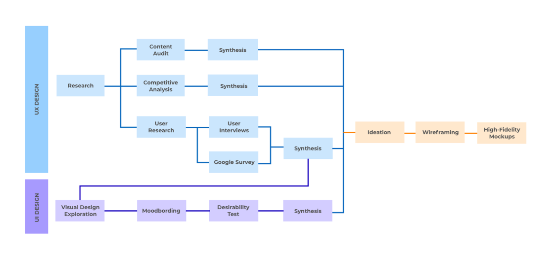
We conducted a few rounds of research, including content audit, competitive analysis, and user journeys, to help us better understand user pain points and design opportunities.
The content audit helped me understand the website structure and potential user pain points.
The main issues are:
Each page did not have a clear goal and strong story-telling, making the page look like an information dump, especially for the homepage. Users may need to visit different pages to know who we are and what we do.
Confusing labels, undefined info hierarchy, and unorganized content made it hard for users to find the needed information. Additionally, The menu structure may not make sense to all the potential audience.
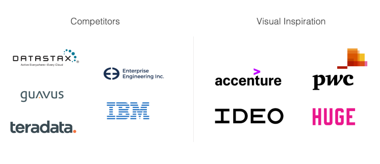
We looked into five competitors to get a better idea of the pattern and design of the industry and four other big-brand companies for design inspiration.
Our key takeaways
Since the services are technical to most users, many websites use short videos to introduce or showcase their services.
On content-heavy pages, text decoration (underlines, bold, highlights, color) helps users better digest content.
Case studies used to be in pdf form. However, recently, most companies have website-based case studies.
A site-wide search button is essential for content-rich websites.
Since we had almost no traffic for the website, we decided to conduct the user research with the 20 company staff, including 10 engineers, 2 managers, and 8 other employees. We used a Google survey to ask questions like, How often do you use the website? What are your purposes? What did the clients say about the website? What do you think about our value propositions? What are the things you like and dislike about the website? What were your emotions when visiting the website?
We also conducted 13 in-person interviews for more questions with another group of employees, including 3 developers, 3 engineers, 3 managers, 2 account executives, and 2 other employees.
We synthesized the results using affinity mapping.
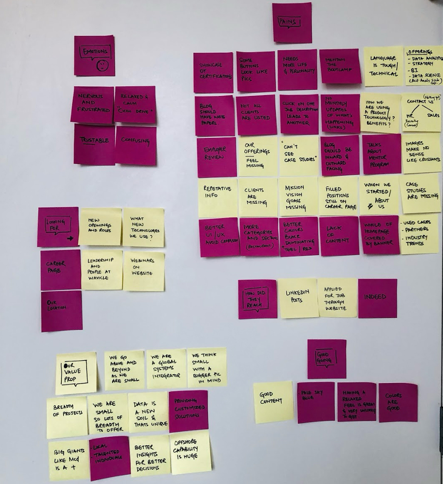
Some of the feedback met our initial findings from the content audit, including:
Users felt frustrated and confused when trying to find something. The sales also mentioned that it was hard for them to find our offerings when they tried to show the website to potential clients.
The language used on the website was too tough and technical for the general population. Additionally, some of the information was repetitive, irrelevant or misplaced on the website.
We also learned something new from the user research, including:
Users didn't know who we are and what we do through the website until they started working here.
The website was lack of personality. Users wanted to see a design that could represent the company's values.
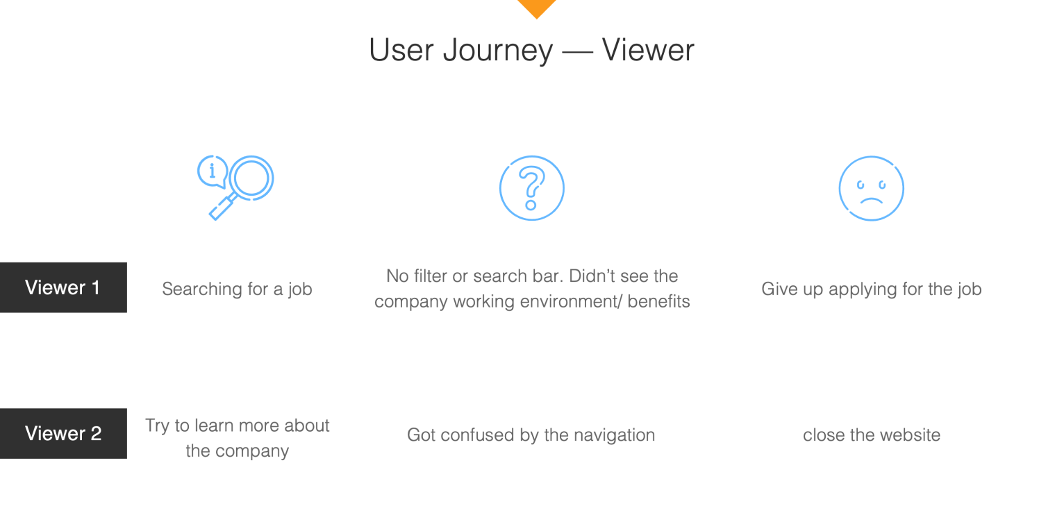
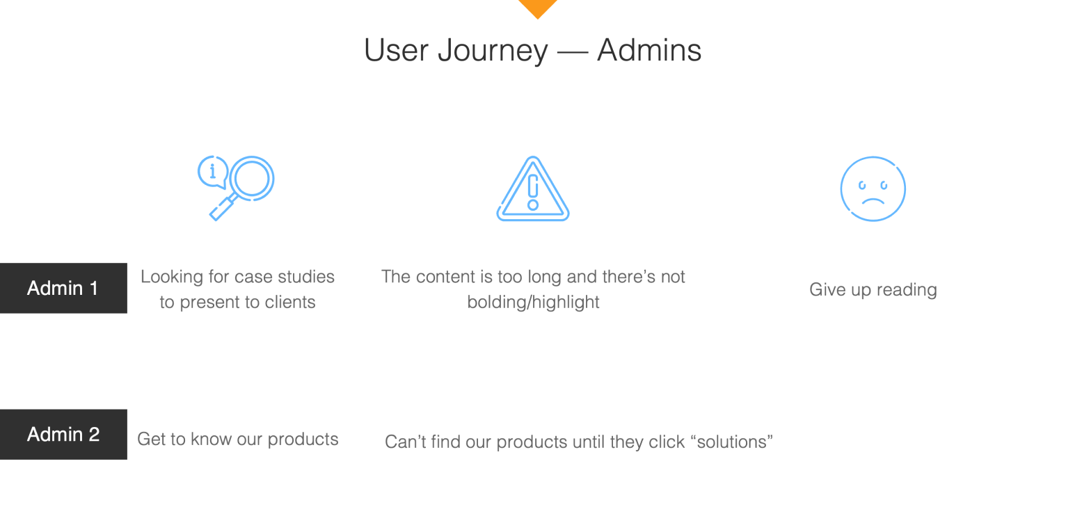
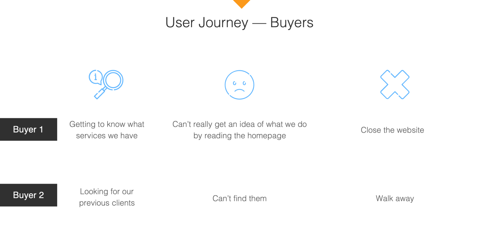
After research and interviews, we identified three main users and their potential journeys when using the website.
Viewers are users who are interested in learning more about the company or users who want to apply for a job with the company.
Admins are company employees who use the website as a tool when trying to sell our services or employees who want to know more about the business.
Buyers are existing or potential clients interested in learning about our services.
By knowing what challenges our users encounter when using the website, we aim to solve their problems and tackle these issues one by one.
I created three moodboards and three style tiles based on the adjectives the employees used when they thought of the Wavicle.
I then showed the design to 10 users and asked them: "Please describe each tile using three adjectives," "Which color palette is the most appealing to you?" "Which tile has the most legible font to you?" "In general, which tile do you like the most?"
The original design used orange as the accent color. However, orange can be tricky for accessible design. Therefore, I introduced blue to the design for better design flexibility.
I used image overlay, textures, and sans-serif typefaces to ensure legibility. I also used photos of people laughing or smiling to create a friendly and warm vibe. Finally, the fine-lined icons provide some visual break in this photo-heavy design.
Users thought this design was:
Inviting, team color, professional, clean, clear, welcoming, straightforward.
Style 2 is a more "risky" design to push the boundary because it's far from the original branding.
I used dark images and neon gradients to create a futuristic vibe. The combination of bold-san-serif text and thin-serif text allows us to design something with better visual hierarchy, especially for content-heavy pages.
Users thought this design was:
Edgy, distinctive, wise, strong, futuristic, captivating, powerful, modern.
Style 3 is a more "conservative" design because it's closer to the original branding.
This design is more graphic-heavy. The imagery is graphic-based, and the icons are more complicated and graphic.
Besides orange, I introduced blue to this style for graphic design purposes. Other colors may be used along with blue when needed.
Users thought this design was:
Clear, simple, standing out, clean, straightforward, crisp, colorful
Our users liked style 1 and style 2 equally. The leadership eventually decided to move forward with style 1 because it is not too different but still a big upgrade from the old design.
Before we start working on the wireframes, we reviewed the sitemap and restructured it based on user research and business needs.
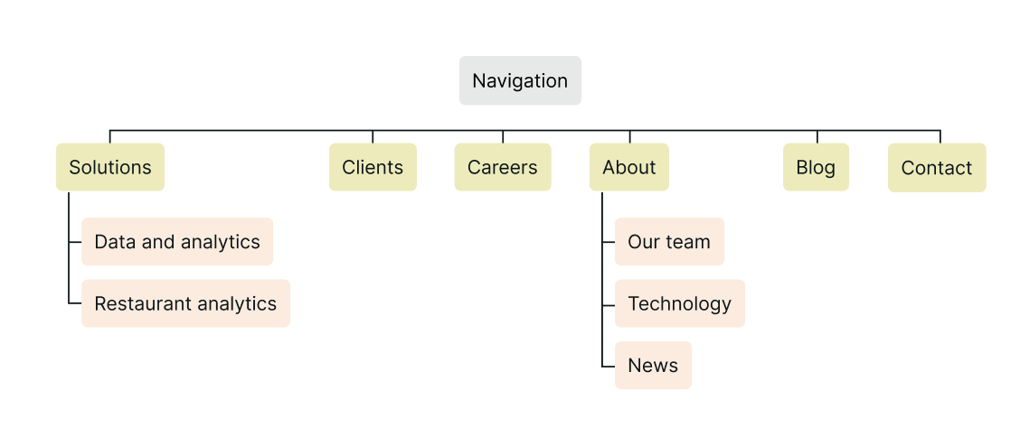
The main issues of the old navigation include:
Confusing labels. Users misunderstood what "solutions (aka what we offer)" and "clients (aka case studies)" meant until they saw the pages.
Missing tabs/content. Users couldn't find the information about the company using the nav.
Accommodation of new content. The nav structure had limited flexibility for newly added content and pages.
To fix the issues, I made the following improvements to the nav structure.
I replaced "solutions" with "services" and "clients" with "case studies" to improve the nav labeling. The changes improved user navigation during the testing.
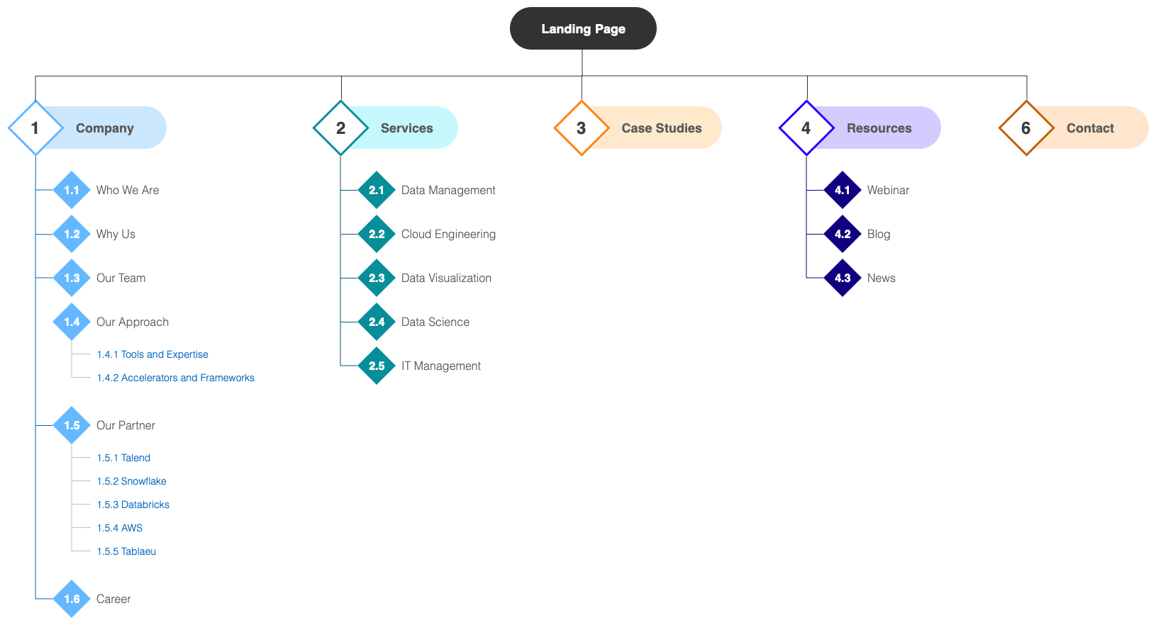
I created the "resources" tab to house all our resources, including our blog, news, career, and webinar. I also added "who we are" to the "about us" tab so users can quickly get the information about the company.
The updated nav tabs—company, services, case studies, resources, and contact—allow us to fit in more content related to the business.
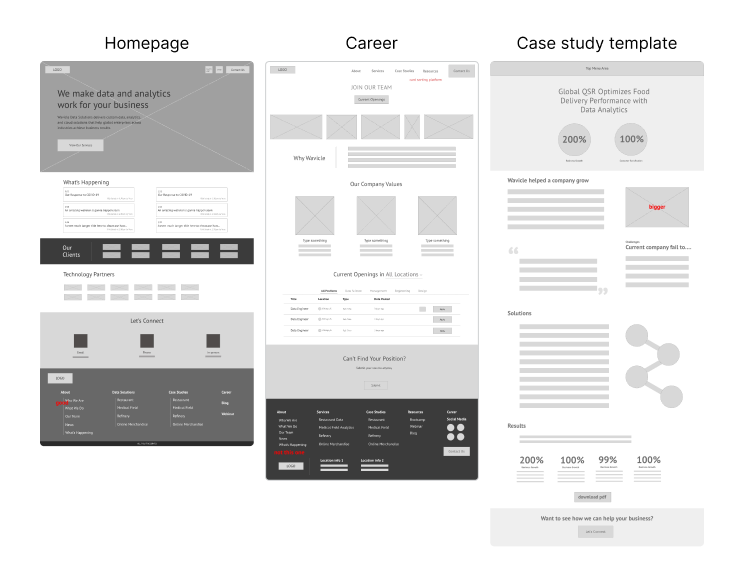
I created a few low-fidelity wireframe screens for the important screens, including the homepage, the career screen, and the template for the case studies. These screens went through a few rounds of feedback and iteration sessions before creating more wireframes and proceeding to high-fidelity mockups.
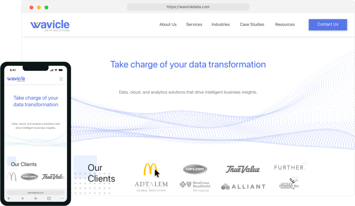
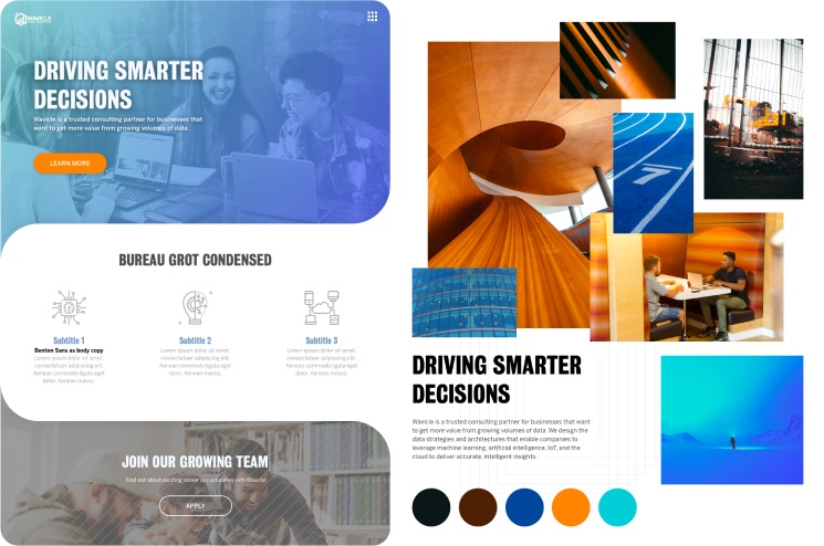
I created mobile and desktop screens using Sketch and prototyped them using Framer X for easier presentation to the users and leadership.
As requested by the leadership, desktop screens were created before the mobile ones, so I always kept that in mind while designing the desktop version to ensure that the design would eventually fit in the mobile view.
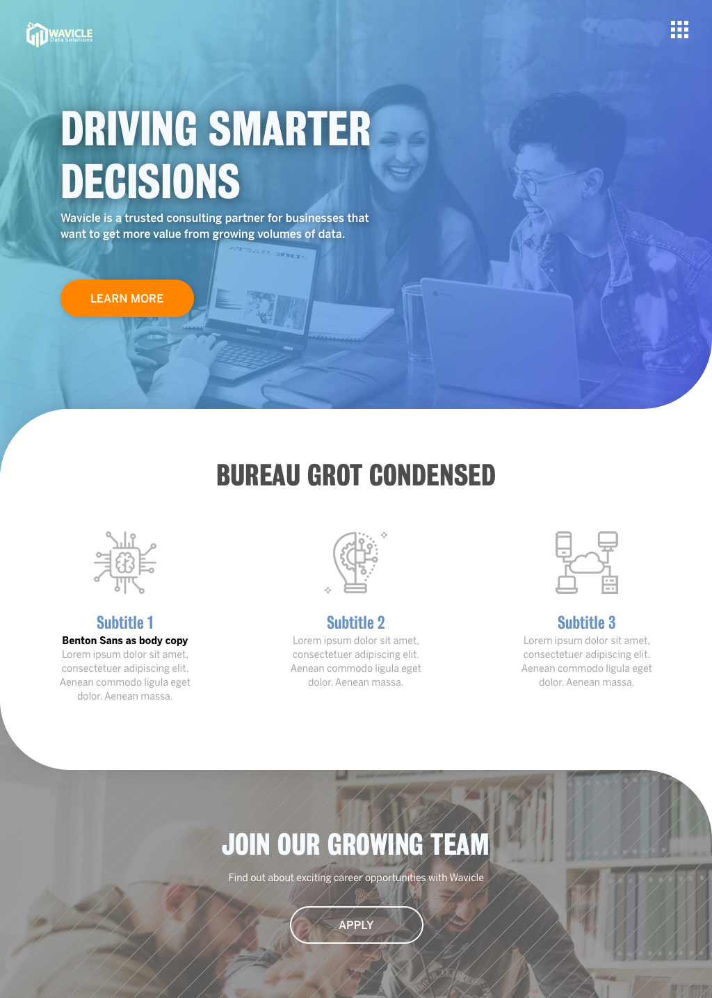
Besides some UX edits, I tweaked some visual design of the website by using dots and waves heavily because Wavicle = Wave + Particle.
Available screens in the prototype above:
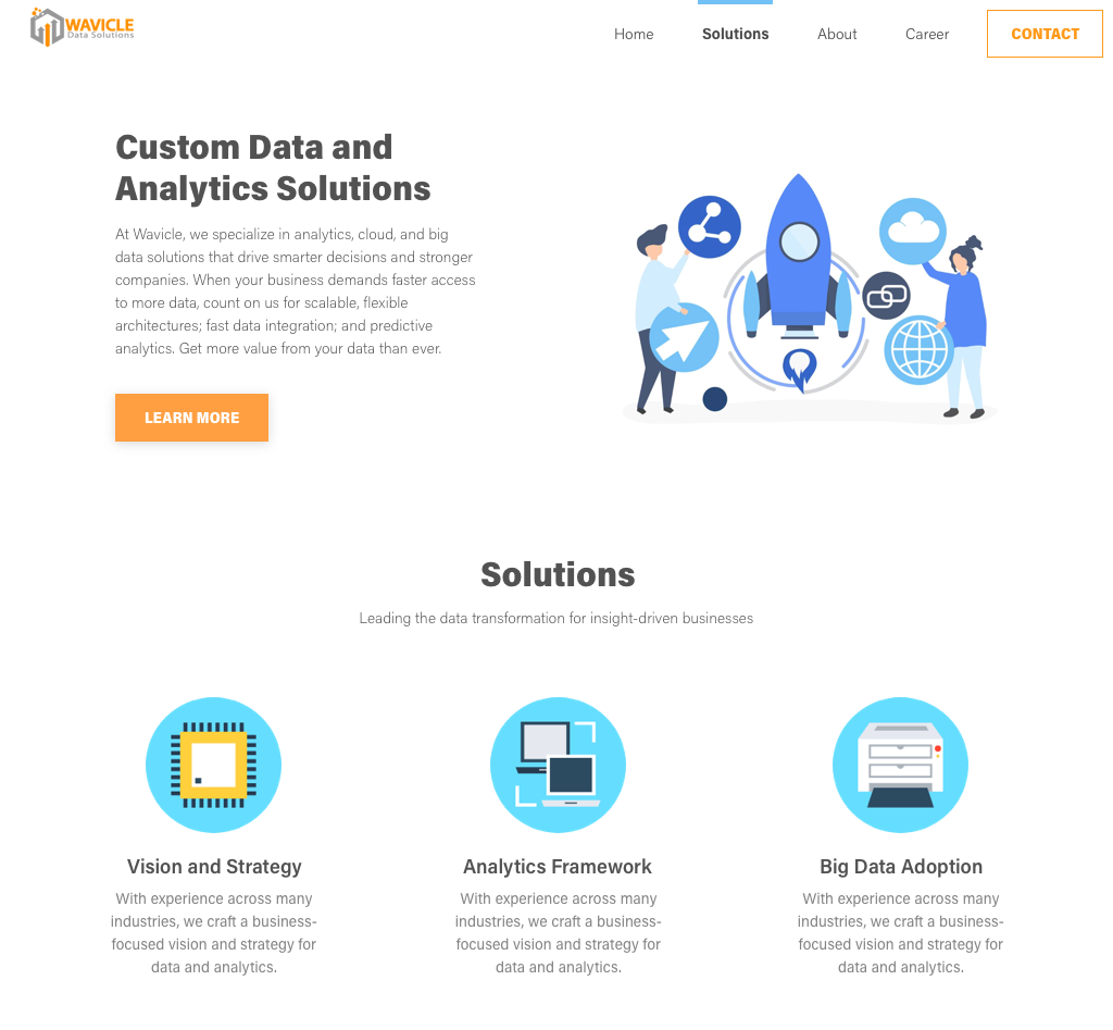
Homepage: The new homepage design is friendly to both new users and returning users. New users get to know us from here by reading the description after the hero banner. Returning users can also quickly find the latest news on the homepage.
About us Why us: A page to introduce the company.
Services Data Engineering: A template for all the services pages.
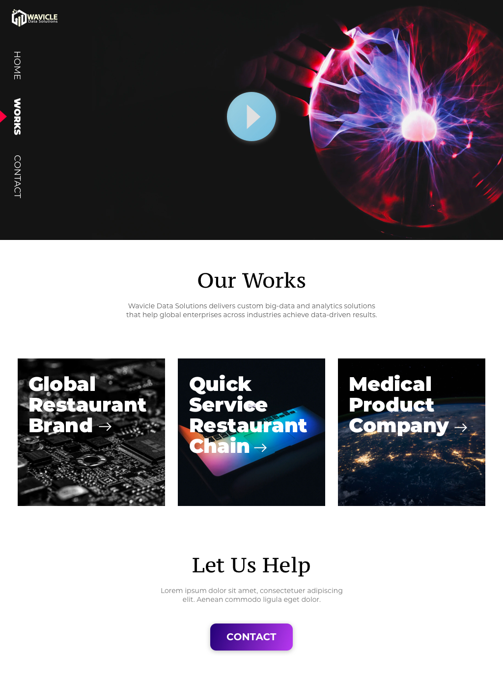
Case studies: A case study "collage" page.
Case studies Restaurant Chain: A template for all the case studies.
Resources Career: The career page focuses heavily on the company culture and values. The job posting sorting system helps users quickly find the jobs they may be interested in.
Contact us: A Contact Us page with location information and a form for inquiries.
I fit all the desktop content into a one-column page on mobile. Some unnecessary images were hidden to ensure fewer scrolls on mobile view.
Available screens are the same as the desktop version.
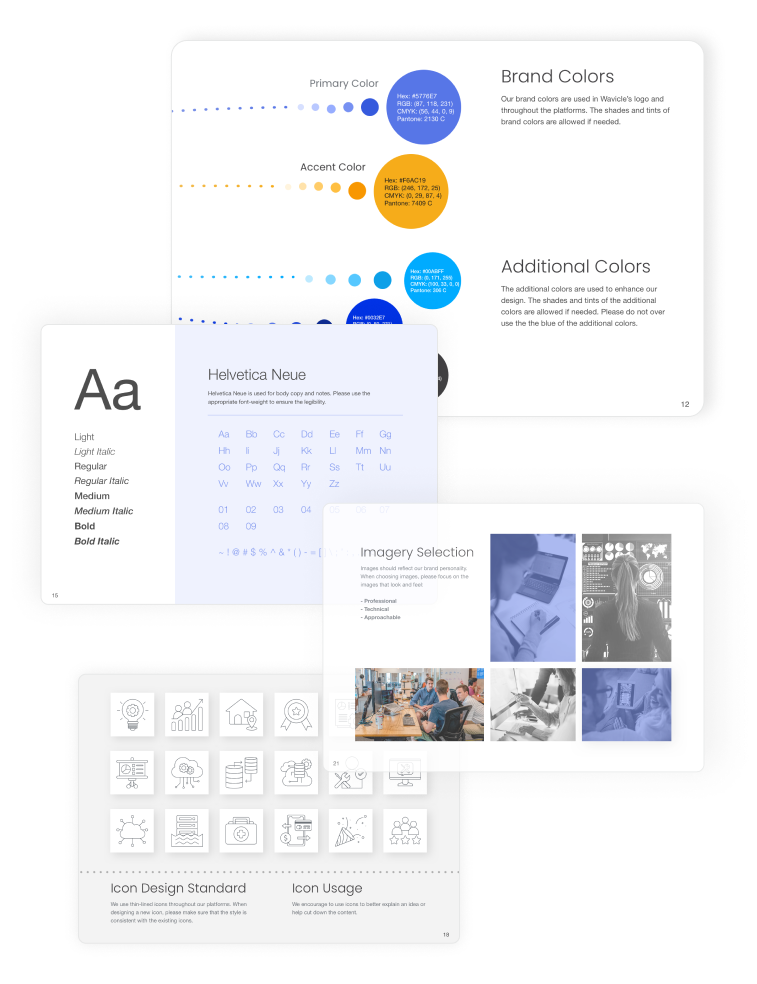
I worked on this project simutanously with the company rebranding project, so I created a style guideline for both the new company branding and the website.
I only created a few pages requested by the leadership and the market team. More pages need to be created to complete the website revamp.
Due to limited time and resources, I didn't conduct usability tests with people outside the company. It would be great to test the product with non-employees to get some fresh inputs.