UIUX Designer
Sketch, Illustrator, Photoshop
Wavicle Data Solutions is a company that provides a wide range of data services that help clients better understand their businesses.
In this project, I was given a logo at the beginning. Everything else was designed around the logo and the company values. At the end of the project, I created a design system to help the company stay within the brand.
I created three moodboards based on the adjectives the employees used when they thought of Wavicle.
I then showed the design to 10 employees and asked them: "Please describe each design using three adjectives," "Which color palette is the most appealing to you?" "In general, which design do you like the most?"
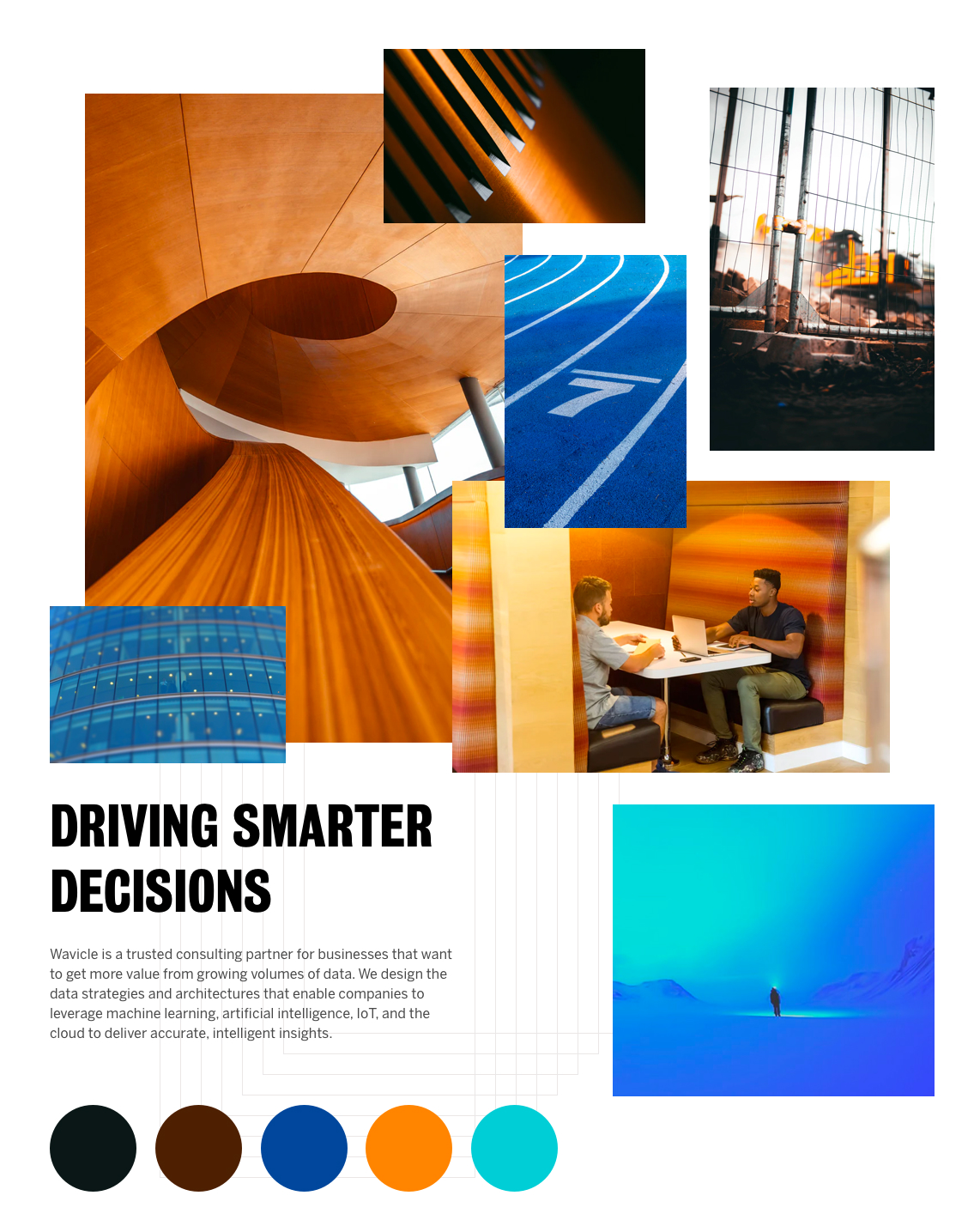
In this design, I use images with waves and dots to represent the idea of Wavicle=Wave+Particle. I also introduced blue to the color palette to improve the flexibility of color use for creative designers.
Users thought this design was:
Inviting, team color, professional, clean, clear, welcoming, straightforward.
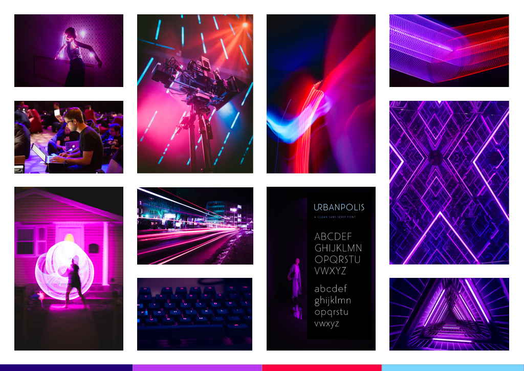
Style 2 is a riskier design to push the boundary because it's far from the original branding.
I used dark images and neon gradients to create a futuristic vibe. Straight lights and beams made it look sleek and modern.
Users thought this design was:
Edgy, distinctive, wise, strong, futuristic, captivating, powerful, modern.
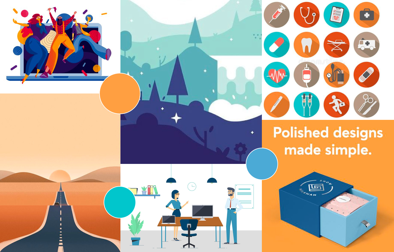
Style 3 is a more "conservative" design because it's closer to the original branding.
This design is more graphic-heavy. The imagery is graphic-based, and the icons are more complicated and graphic.
Users thought this design was:
Clear, simple, standing out, clean, straightforward, crisp, colorful
Our users liked style 1 and style 2 equally. The leadership eventually decided to move forward with style 1 because it is not too different but still a big upgrade from the old design.
The “W” represents a stand alone spirit, collaboration and Wavicle. The play of colors brings in an interesting nuance of transformation and how the company empowers organizations with their digital transformation.
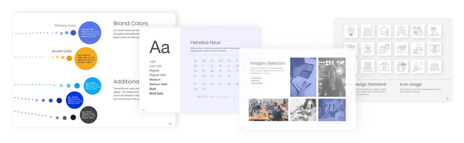
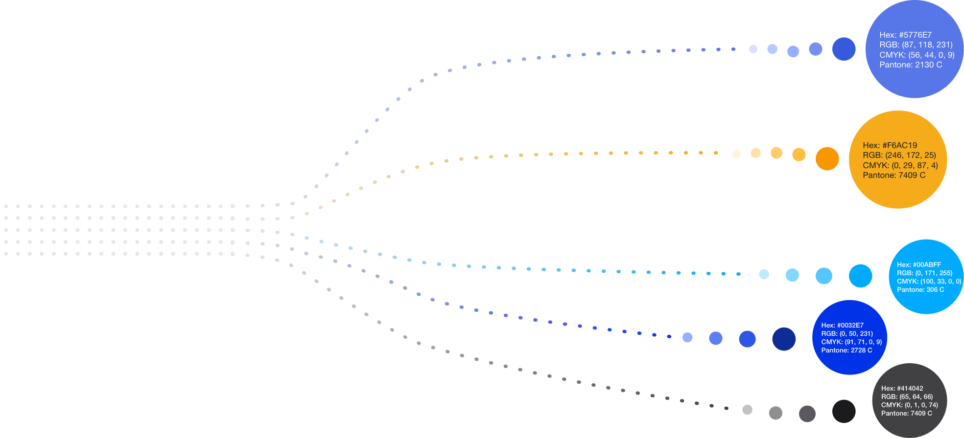
The original brand used orange as the accent color. Orange can be tricky to work with because of accessibility concerns.
In the new branding, I introduced royal blue as the accent color along with other colors to the color palette. I also defined shades and tints of all the colors to provide better flexibility for creatives.
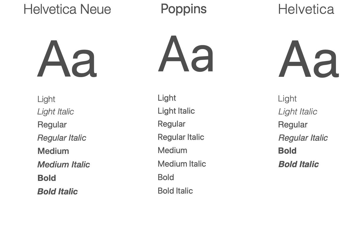
Wavicle provides content-heavy marketing materials frequently, so I used sans-serif typefaces to ensure legibility.
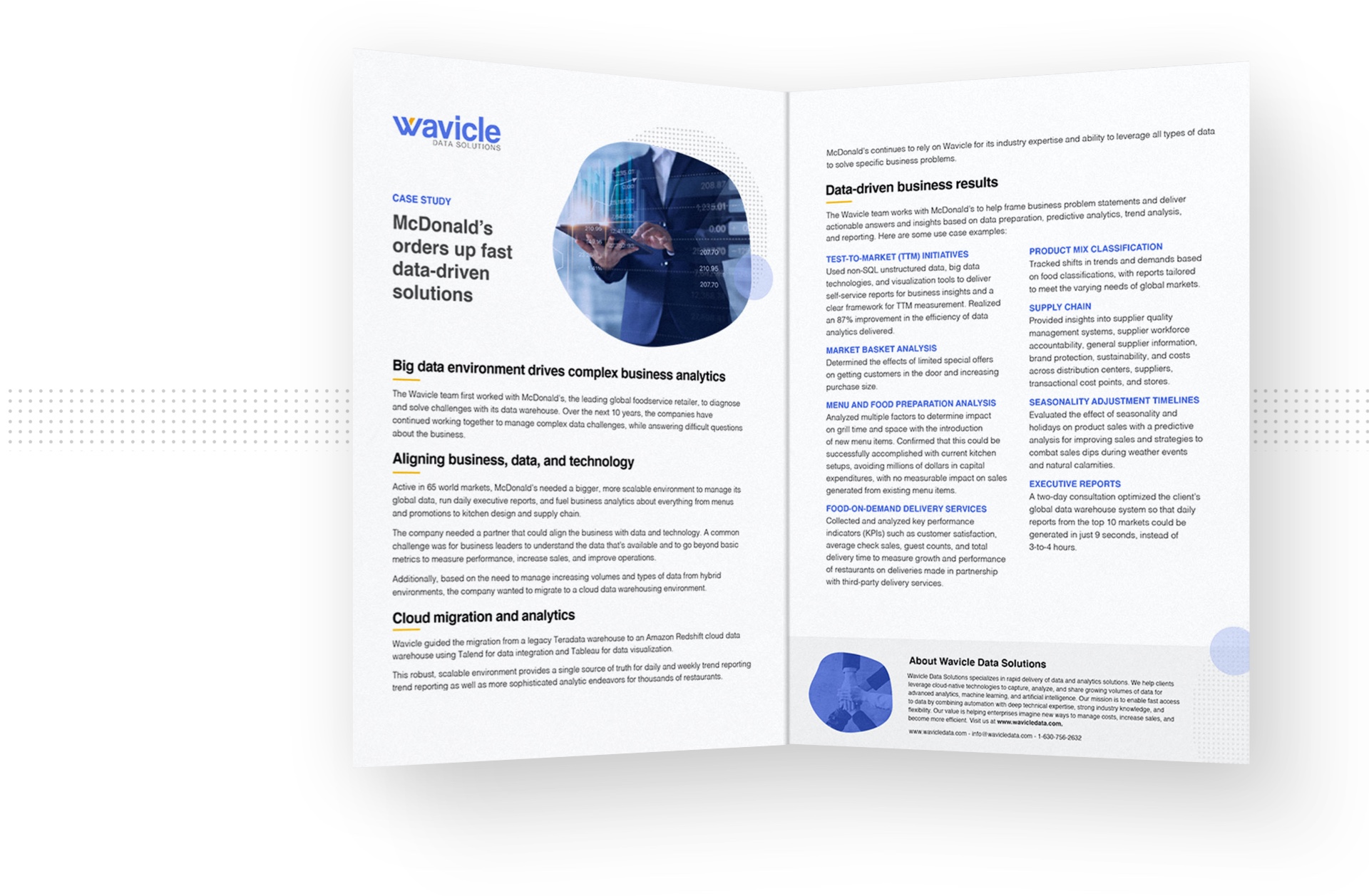
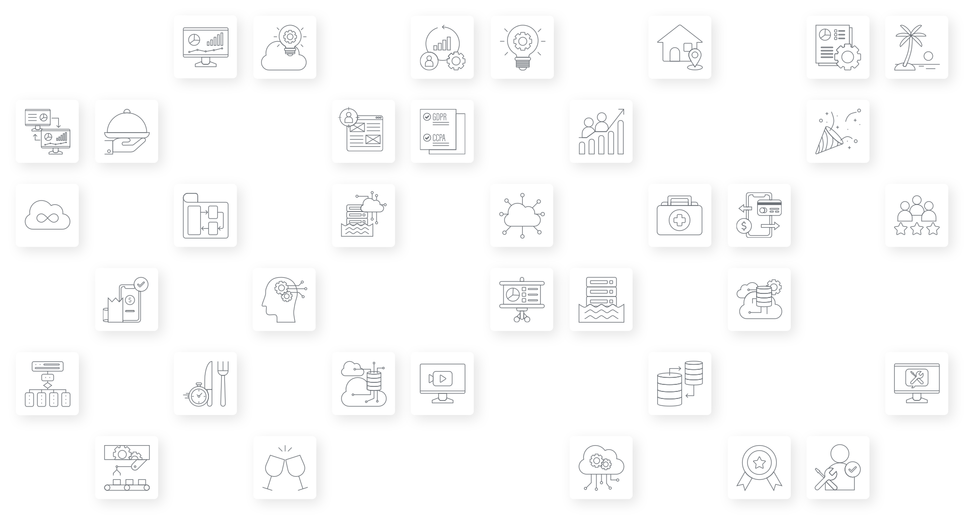
I used thin-lined and self-explanatory icons to help with storytelling and balance the heavy content.
We included people in the images to make the company look approachable and friendly. Depending on the scenario, I applied a monochrome or blue overlay to the photo to make the overall design more cohesive.

I created a style guideline for future designers to follow and design creatives that are in-brand.