Role: UI Designer
Duration: 5 weeks, 5 sprints
Platform: iPhone 8
Tools: Sketch, Principle, Illustrator, Keynote
Stride 360 is a 2-in-1 bike/elliptical fitness machine coming with a mobile app that can control the bike/elliptical and track users' workout activities. In this project, I designed an iOS mobile interface, a logo, and a mobile-first marketing site.
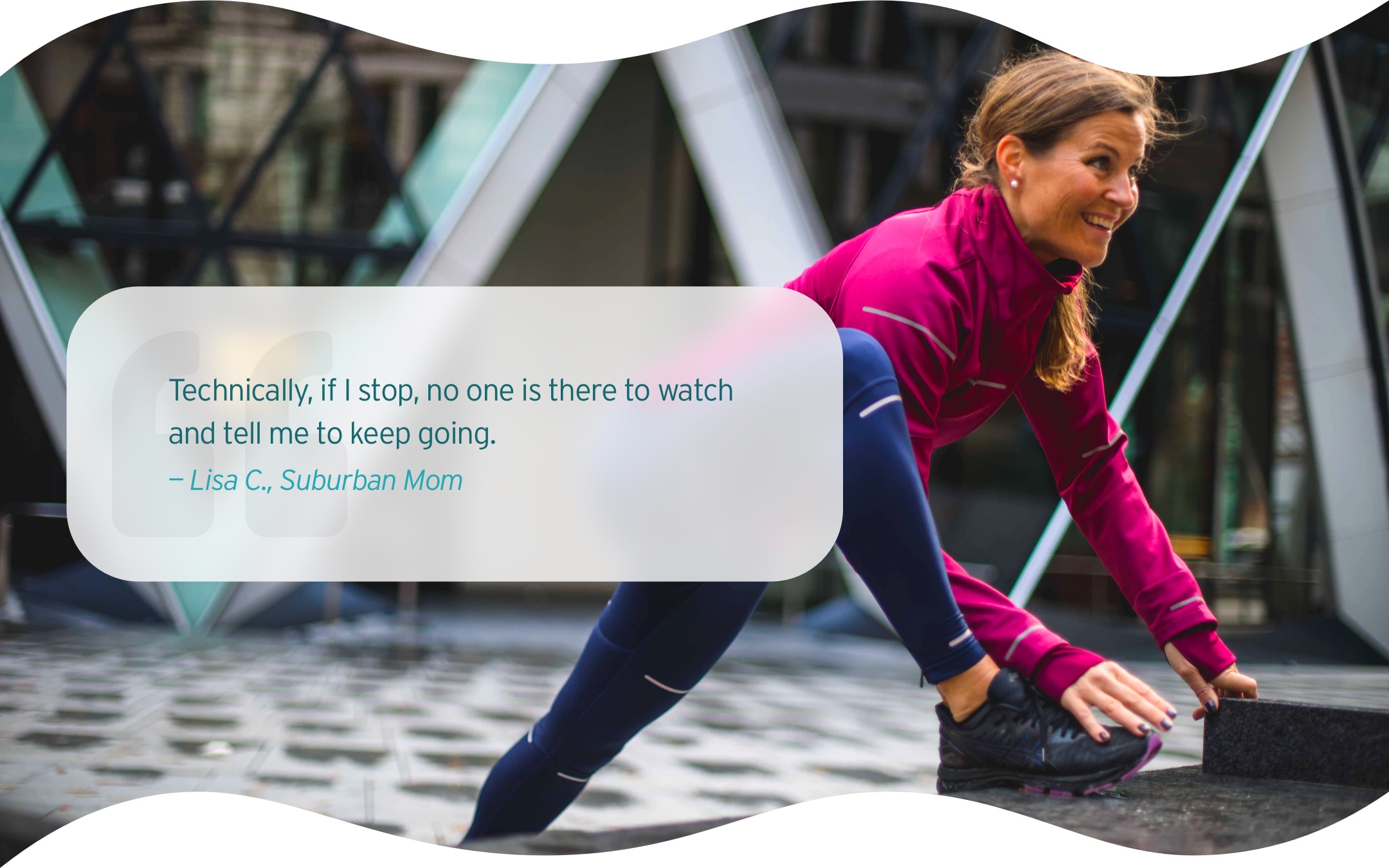
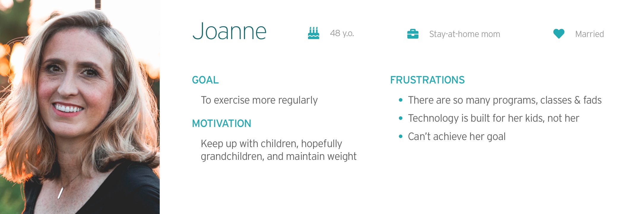
Our target users are suburban moms. The UX team conducted interviews with 12 suburban moms aged between the 40s – 60s. The results showed that our target users struggle to exercise regularly and can't handle intense exercises anymore. Therefore, they aimed at staying active and motivated with low-impact workouts.
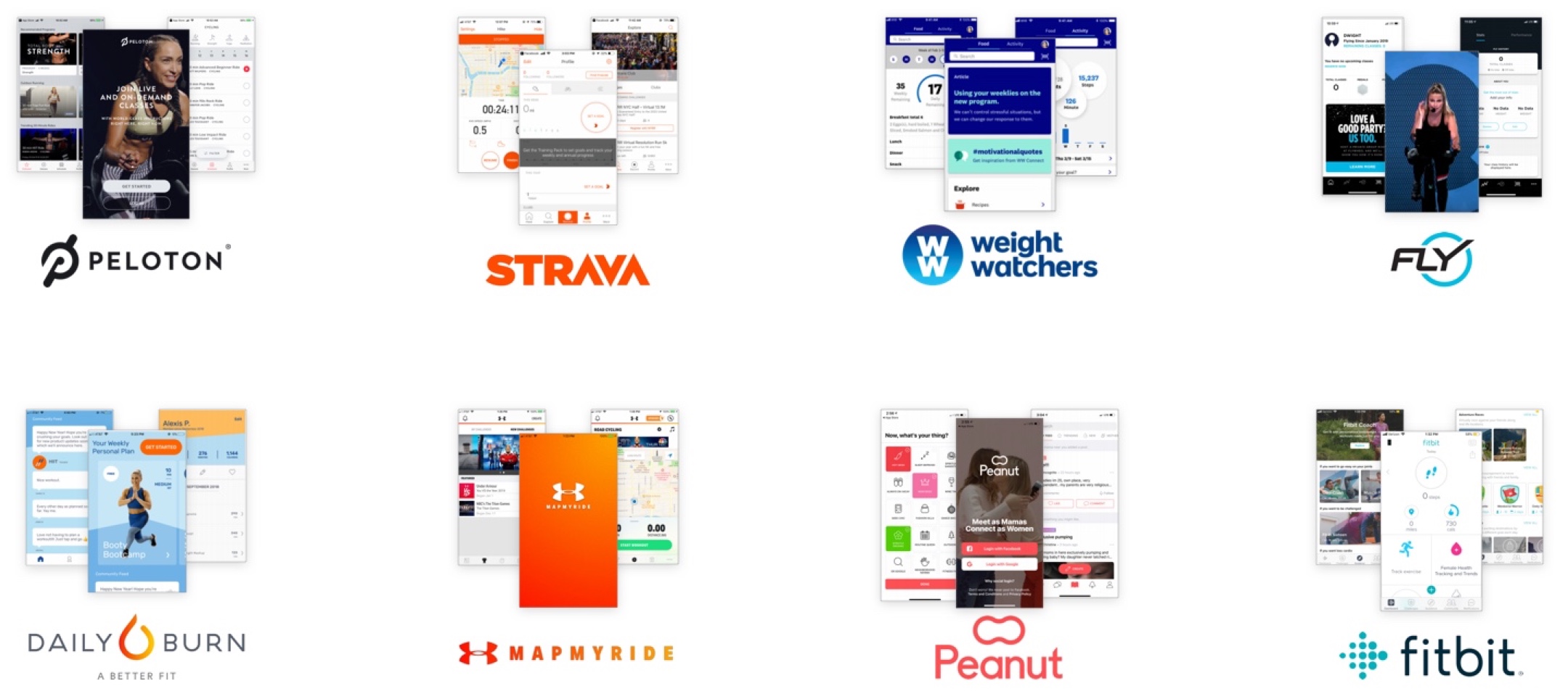
We conducted a visual competitive analysis to better understand our competitors, including Fitbit, WeightWatchers, Fly, Peloton, MapMyRide, Strava, and Daily Burn HIIT. We also looked into Peanut for design inspiration.
The use of informal and casual language, variety of colors, and custom illustration makes the interface more friendly and supportive.
Darker interface, ideal body image, and limited use of colors create high-end, high intensity, and exclusive feels.
With the information synthesized based on the SME interview, UX hand-offs, and research, we came up with three design principles to help us create a user-centered interface.
Research shows that competitions don't motivate our users. For this reason, we will utilize supportive content and microinteractions to delight our users and promote consistent engagement with this application.
Our users are not tech-savvy. By using familiar UI patterns, concise copy, and clear affordance, we want to design an interface that our users can easily navigate.
Stride 360 is inclusive of all ages, sizes, and fitness levels. For this reason, our designs will also be inclusive by utilizing realistic imagery, as opposed to only showing the idealized body shape.
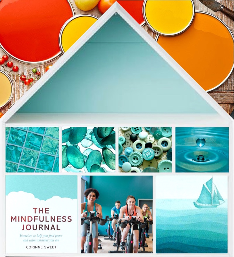
To create an interface that meets the brand values, I explored three concepts: The Journey, The Support, and The Home. I started with moodboarding, followed by building style tiles based on the moodboards I created.
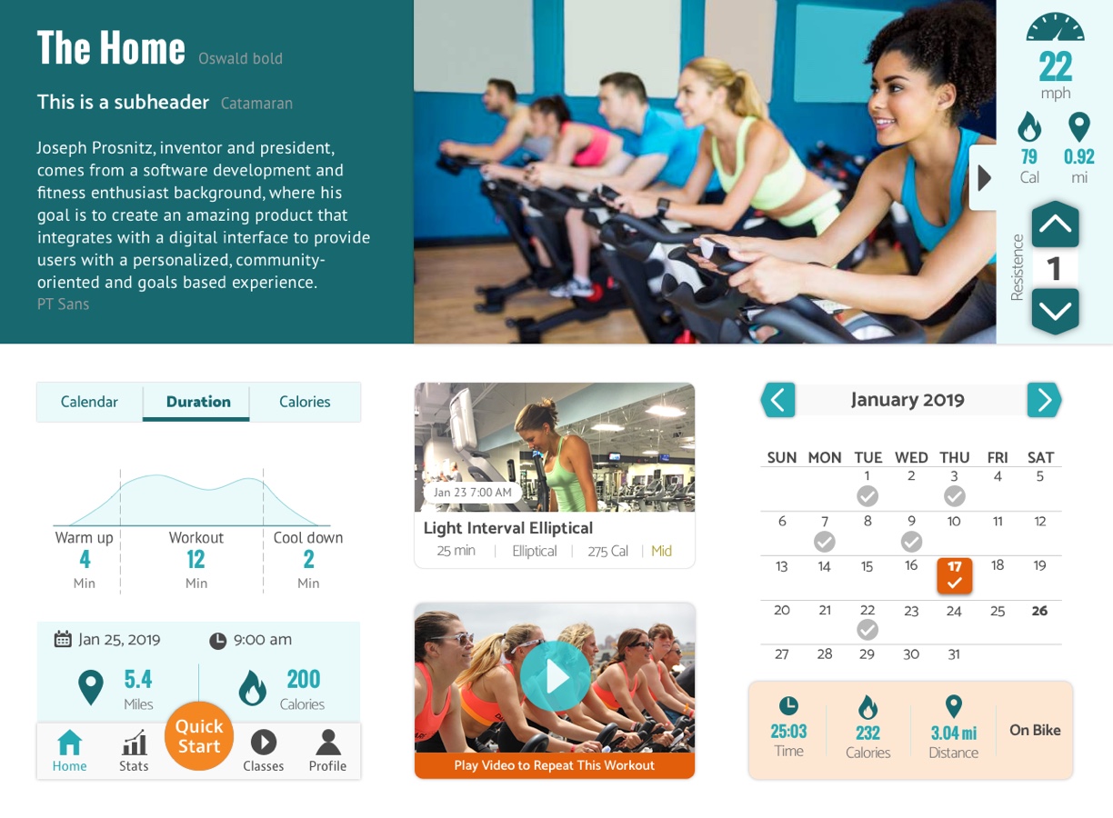
This design is my final direction because it meets user needs and the brand values the most.
I used aqua as the primary color to make users clam and orange as the accent color to motivate people. The rounded corners and the community-oriented images make the design more approachable. Additionally, I use home-shaped buttons to carry out the idea of home.
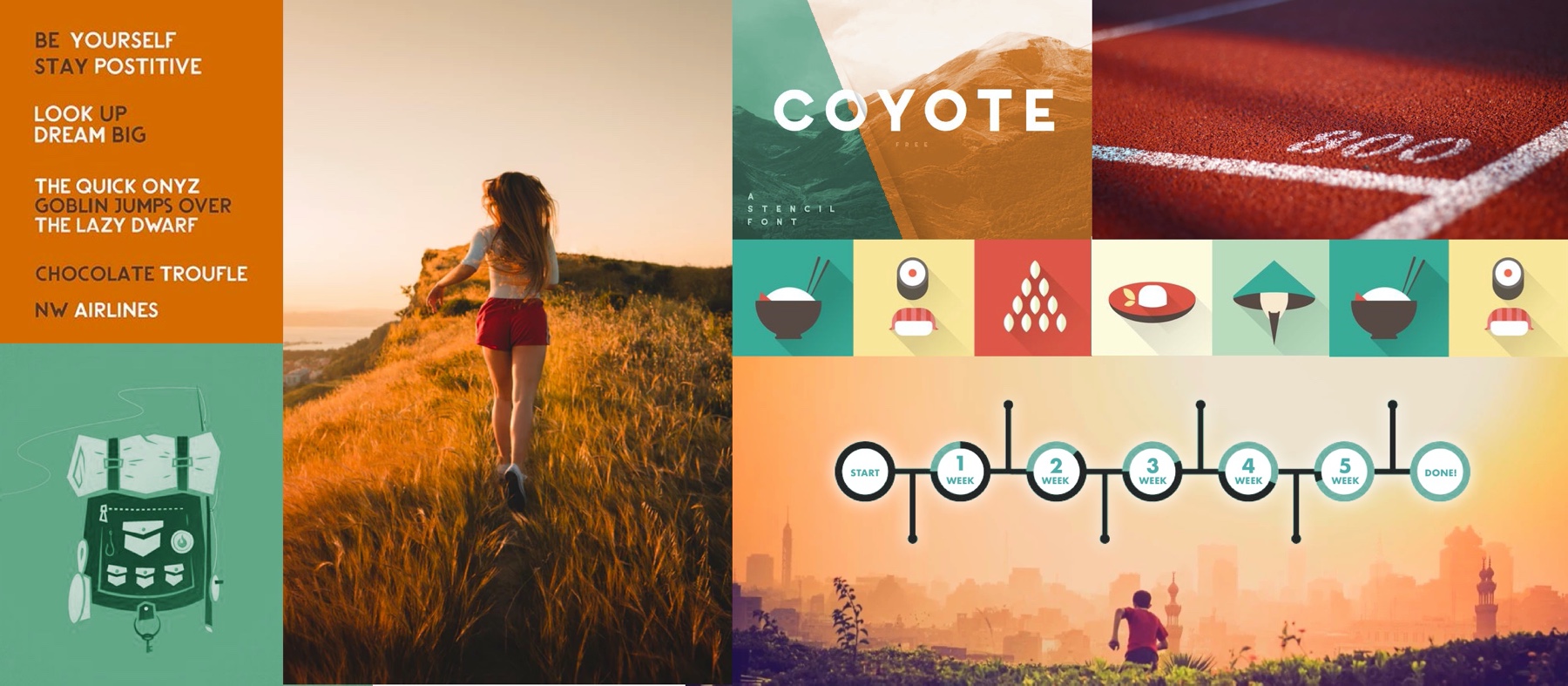
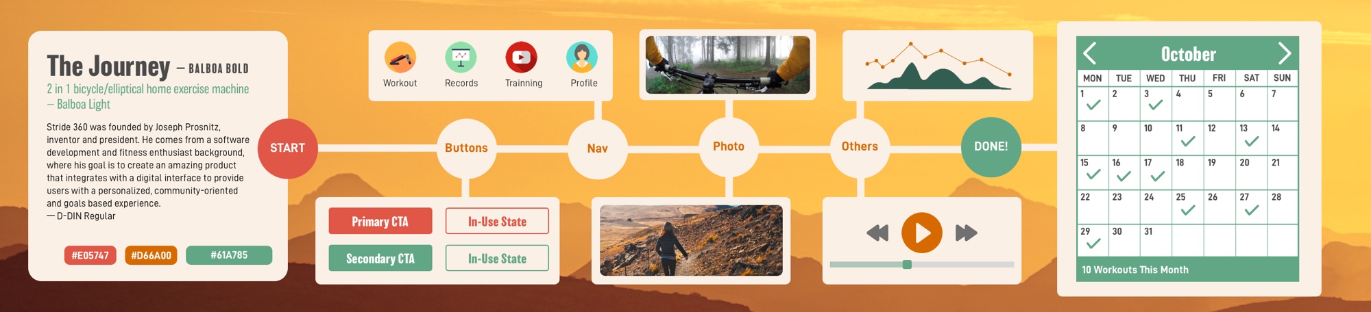
I used a timeline to show the idea of "fitness as a journey." The color combination and the illustrations made the design more friendly and motivating. Using photos of a person working out solo, I want to show that this fitness journey is personal.
However, I didn’t move forward with this concept. Thinking of our users, who are in their 40s - 60s, this design may not fit in their homes and lifestyle.

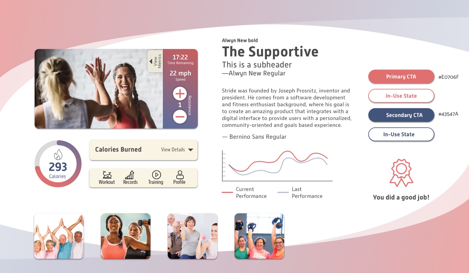
A support system helps our users keep their exercise habits. I used warmer colors and supporting imagery to encourage our users. The rounded corners and gradient also make the design more friendly and approachable.
I didn't choose this design because this design was too specific to the female population; however, male family members would also use this product.
I started the process with sketching to come up with as many ideas as possible. Next, I picked a few logo concepts and digitalized them. Then, I asked for feedback and kept iterating until they were polished.
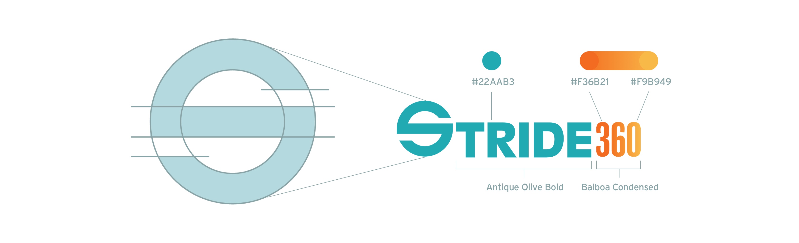
Finally, I chose the following logo because the circular “S” signifies the wheel of the Stride 360 machine. Additionally, this logo encourages our users to keep spinning and moving on their fitness journeys, just like the spinning "S" animation I made for Stride 360.
I evaluated the UX wireframe and iterated the UX design further to improve usability. The main changes I made are as followed.
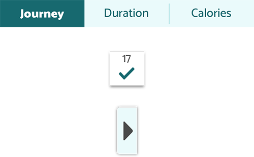
There are two main sections on the home screen — the overview of the weekly exercise and the past workouts. The overview encourages our users to exercise more; while the workout history allows users to access and repeat their past workout sessions quickly.
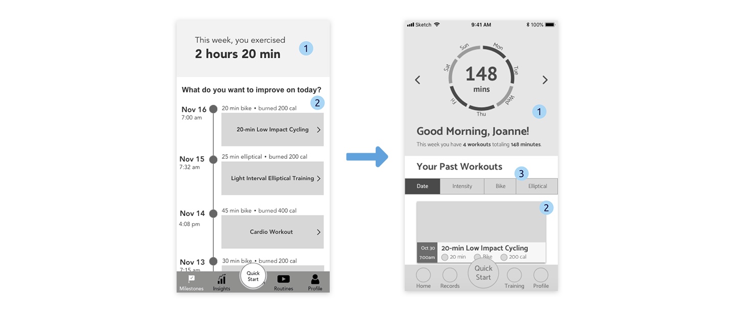
1 The overview of accumulated workout duration at the top section notifies our users how far they have achieved in this week. However, it doesn't visually motivate our users.
2 The visual hierarchy didn't help make the most important information stands out. For example, the date was so prominent on this screen; however, it's not as important as other information.
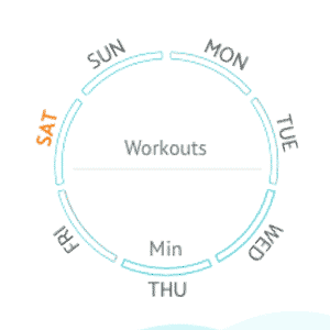
1 I created a workout wheel showing the overview of the weekly workout to motivate users to complete all parts of the wheel by exercising more.
2 I changed the layout of the past workout to enhance the information hierarchy.
3 I added a filter to help users quickly find their preferable workout when there are too many options.
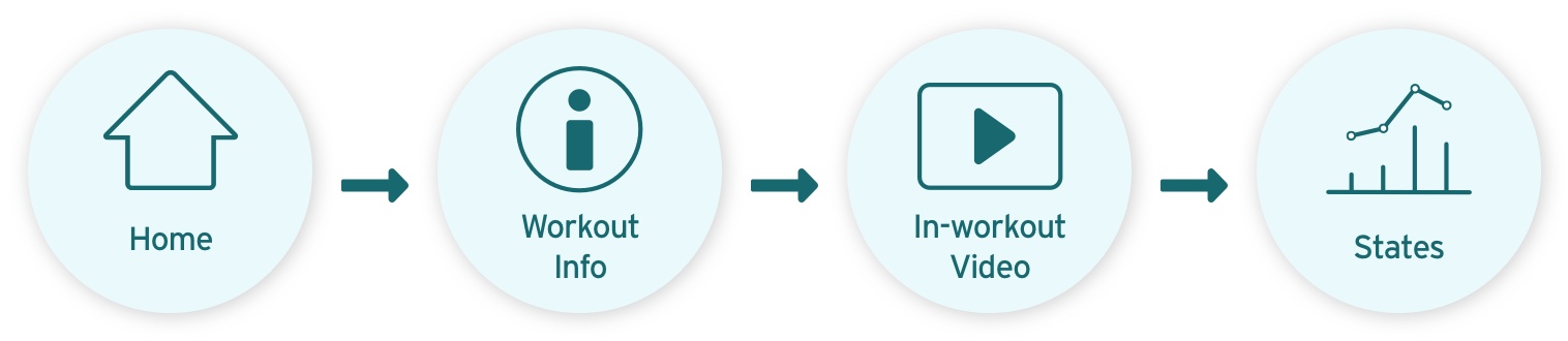
The bottom navigation guides users to four main screens:
Home is the landing screen where users can see the previous workout history and weekly overview. Stats provides statistical data of workouts, such as calories burned, workout duration, and workout dates. Classes provide workout training videos. Once users have played the videos, they can easily access them through the home page. Profile is where users can see their profile or personalize the app.

1 The labeling was confusing. We weren’t able to tell the differences between milestones and insights, and we couldn’t tell what routines mean until we tap it.
1 I changed the labels for the bottom navigation to better describe the functions.
On the workout insight screen, users can see the preview of the workout video, a summary of the previous workout on this video, the workout details, and the description of the workout.

1 The text on the video preview may have legibility issues.
2 Most of our users didn’t know what output was.
3 The UX team mentioned that the button should always be visible when users scroll up and down. However, the position of the button in this design may limit the length of the content.
1 I created a section of workout details so that I can move all the workout information from the video preview to here.
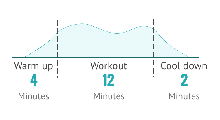
2 I visualized the workout structure so that users can anticipate what is going to happen during this workout.
3 I removed output and kept distance and calories.
4 Instead of using the "repeat this workout" button, I added a play button to the video preview, which will be sticky when users scroll the screen.
Users can follow the in-workout video during their daily workout with Stride 360 bike. They can track the workout metrics in the process as well as change the resistance of the bike at the same time.
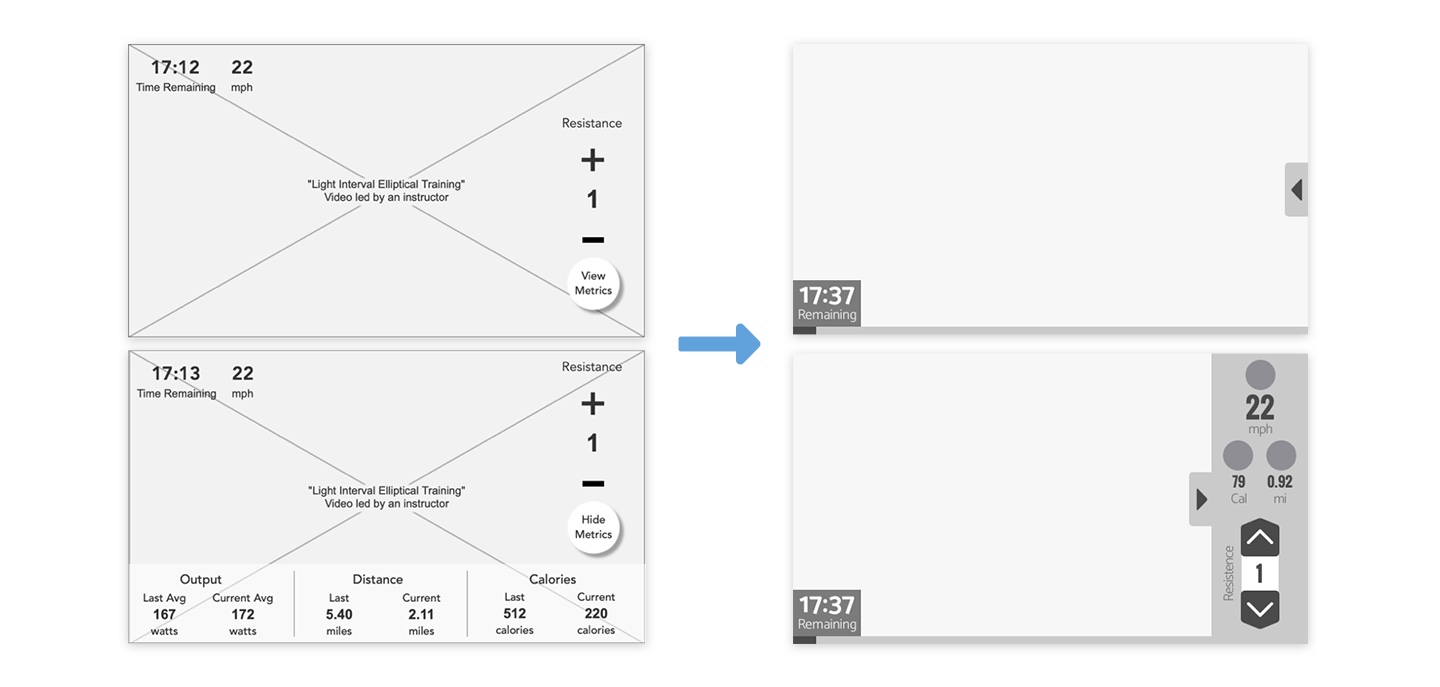
1 The metrics and resistance control took up too much space. It can be hard to view the video; especially, on the phone.
1 To clean up the screen, I created a side panel that contains resistance control and all the information needed. Users can call out the side panel whenever they want. If not used, the panel slides out of the sight so that it doesn't block the view.
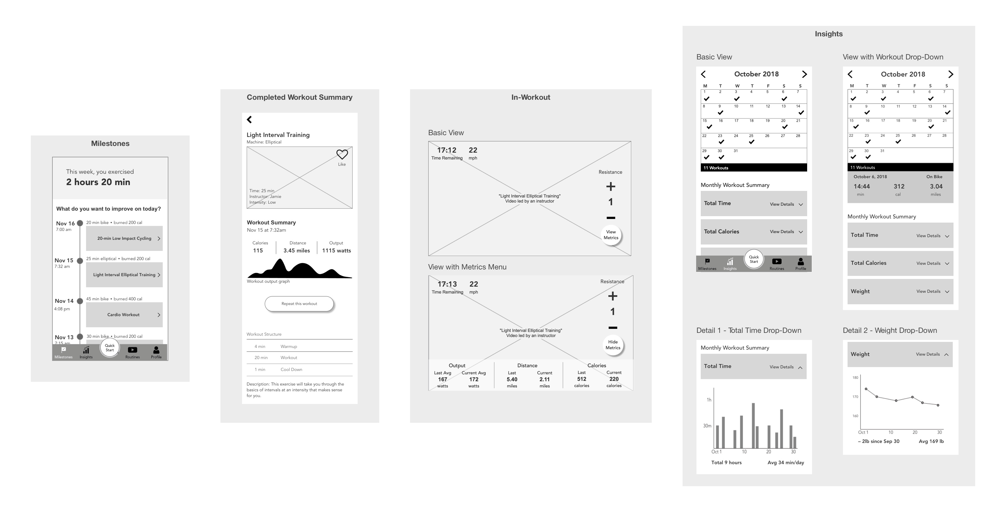
Users can track their workout history here. The calendar function was tested positive as our users loved seeing their workout journey at a glance.
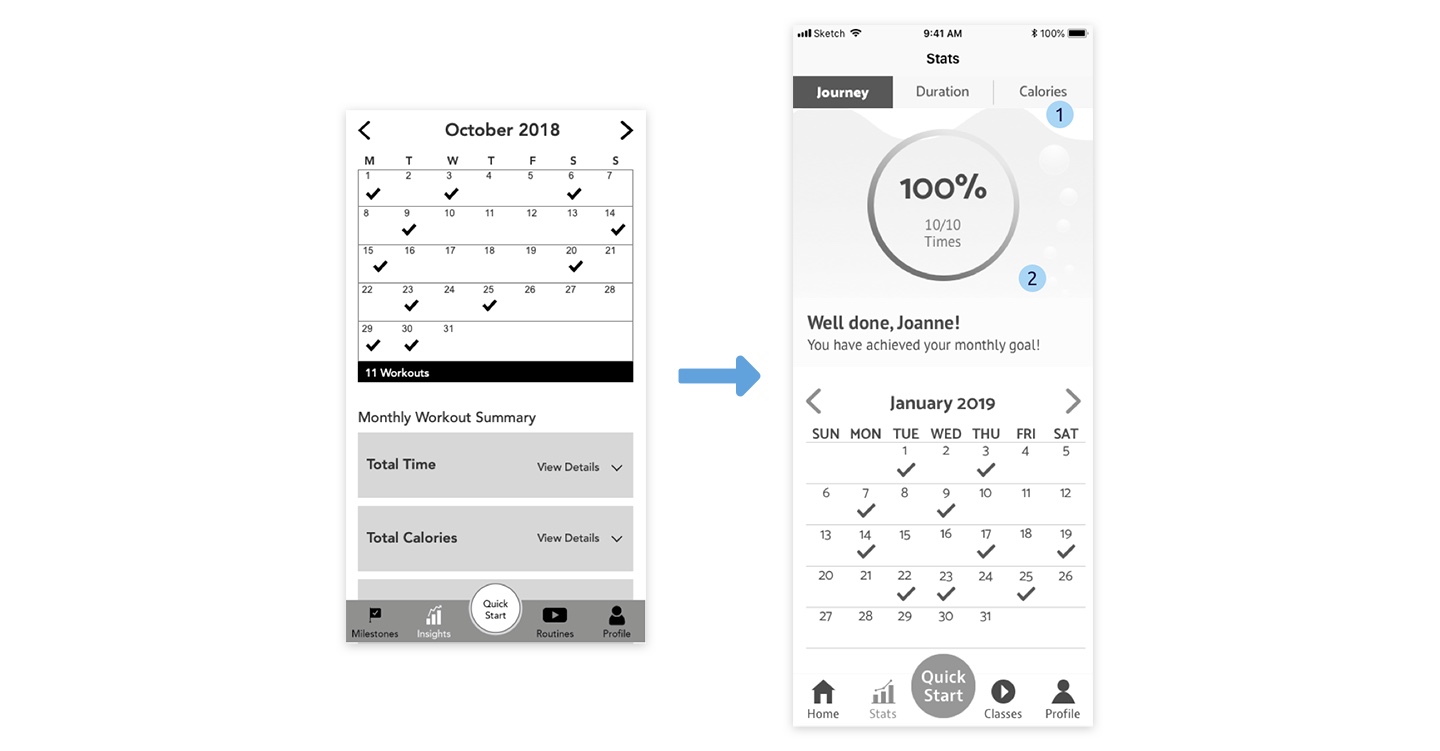
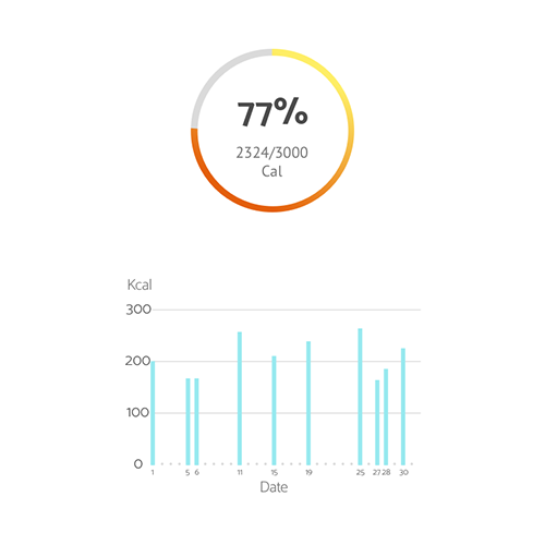
1 The UX team incorporated all the stats into one screen. The data presentation can be overwhelming when viewing all the information on the same screen.
1 I created a tap bar at the top for users to switch among different stats they want to view.
2 I created an overview wheel to motivate users to complete their monthly goals.
I created this wheel to provide an overview of the weekly workout summary as well as motivate users to keep their exercise routine. Once users enter this screen, the wheel lights up in orange if users worked out on that day, or in gray, if not.
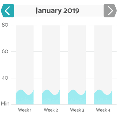
On the stats screens, I used the idea of water and tubes to encourage users to fill up the bars by working out more regularly.
The countdown screen pops up after users hit the play button on the training videos. It gives time to users to step on the bike and be ready for the exercise.
For the usability testing, we remotely talked to 4 suburban moms aged from the 40s to 60s who had iPhones. We asked them to download the Principle app to test the prototypes on their phones. I asked them to complete the following task flow.
Our users liked the colors. They thought the colors were pleasant to the eye.
Our users liked the workout structure on the workout info screen because they can tell what to expect on this specific workout.
Our users thought the text on the phone was big enough for them to read when they're in motion.
I found that some of the buttons were unnoticeable to our users, including the tap bar, calendar checkmarks, and the call out button for the side panel on the in-workout screen.
I'll need to make the buttons more noticeable by making them more prominent or by adding some microinteractions.
The wheel was supposed to motivate our users; however, our users found it redundant because our users had to scroll up to see the information they needed. As for the graphs, users mentioned that the numbers are almost illegible on a small screen.
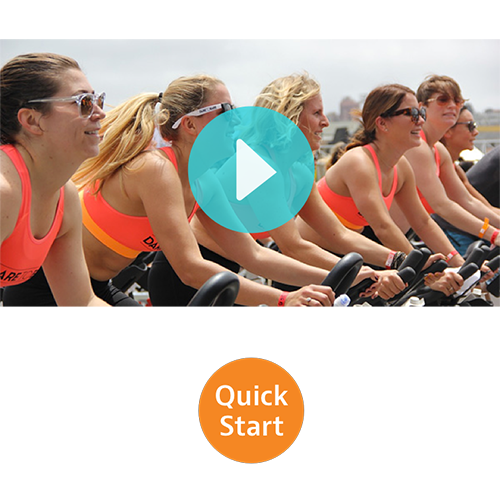
On the workout info screen, users start a workout by hitting the play button on the video preview. However, many users hit the quick-start button instead.
I need to clarify the different functions of these two buttons in the future.
I made the following walkthrough with Principle, which allows me to create appealing animations to motivate our target users who need encouragement to stay active.
Joanne has been using the Stride 360 app for a few months. Today, she opened the Stride 360 app and was immediately greeted by the splash screen. She was excited when she saw the weekly overview wheel lighting up based on her workout history. She can't wait to start her workout of the day.

On the home screen, Joanne browsed through the workouts she has done over the past few days. She decided to improve on one of her past workouts: Low Impact Cycling. She tapped it and viewed the details of this workout. Joanne decided to go for it.

Joanne hit the play button and rode on her the Stride 360 bike before the countdown ended. She saw a side panel on the screen slid out of her sight when the training video started. Joanne called out the side panel by tapping the button on the right to see her workout metrics and to control the resistance of the bike.
After the workout finished, the app went back to the home screen, where Joanne saw the updates of the overview wheel.

Joanne wanted to see how she has done for today's workout. She went to the calendar and tapped today's date to view the workout detail. She also checked out her duration/calories of the month and was satisfied with her improvements over the past few weeks. Now Joanne is a happy and healthy mom because of Stride 360.

It's vital to stay in-brand when developing the app. For this reason, I created a style guide that incorporates the information of the brand elements to ensure that future designers and developers follow the brand rules while developing the Stride 360 application.
We built our project based on the persona who has been using the app for a while. Future developers and designers need to consider the empty state for first-time users.
We opted out user-generated content at this moment because our users mentioned that they had little interest in it. We also believed that Stride 360 should initiate content production in the beginning to ensure the quality of content. In the future, designers and developers may consider creating a platform for user-generated content once they have well-developed content policies and sufficient user population.
Due to limited time, Classes and Profile functions were not fully built yet. Consider creating the content that provides user-centered experiences to our target audience.
When deciding on the final design direction (moodboard and style tile), I did have my preference. However, I learned to detach from my preference by making all the design concepts equally good and likable. By doing so, I’m sure I was fair and felt no pain when picking the design for our target users.
Being open to all the possibilities means that I may need to give up my favorite things. However, every time I did so, I found myself gaining a lot more than I would have expected. I enjoyed this process of reimagining myself and rebuilding my process. This project made me a bit better every time I opened up Sketch and iterated on my designs.