Role: UI Designer
Duration: 4 weeks, 3 sprints
Platform: Android Tablet
Tools: Sketch, Principle, Framer X, Keynote
Neopenda is a biotech startup that aims to provide low-cost medical solutions for patients and medical professionals in developing countries. In this project, I designed an Android tablet interface based on user tests.
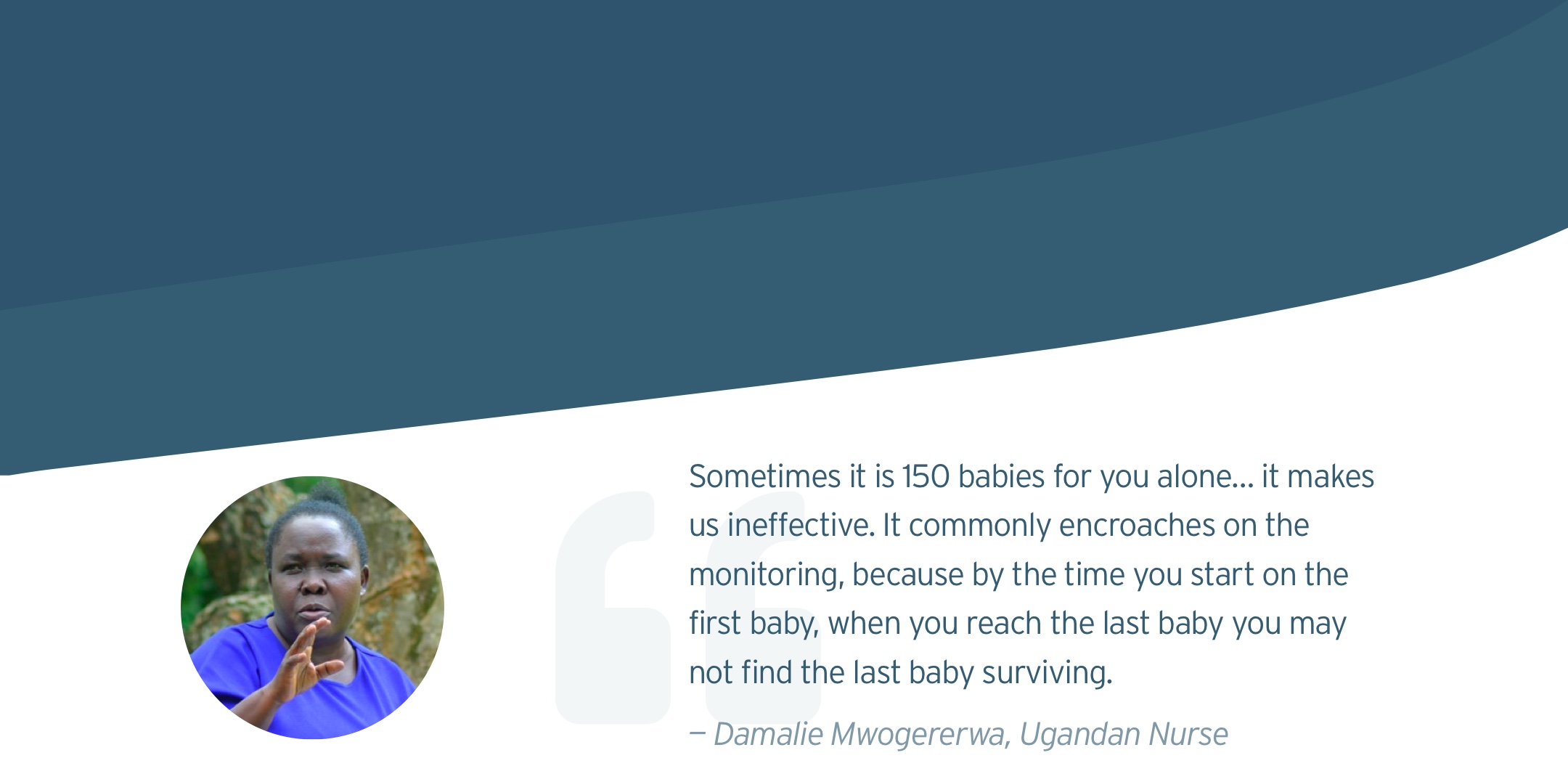
Each year, nearly 2.5 million babies died from preventable conditions in developing countries partially because of poor resources in health facilities. Nurses in these countries are heavily overwhelmed by the tremendous workload.
To address this issue, a UX team had previously worked with Neopenda and developed a wireframe solution for these nurses. Our goal was to create an interface based on their wireframes and improve the usability of the app for Ugandan nurses.
Consider the alarm fatigue. Multiple alarms going off at the same time may be common in our users’ working environment.
Our users are overwhelmed by their day-to-day work. This application should make their lives easier without adding any learning curve or workload.
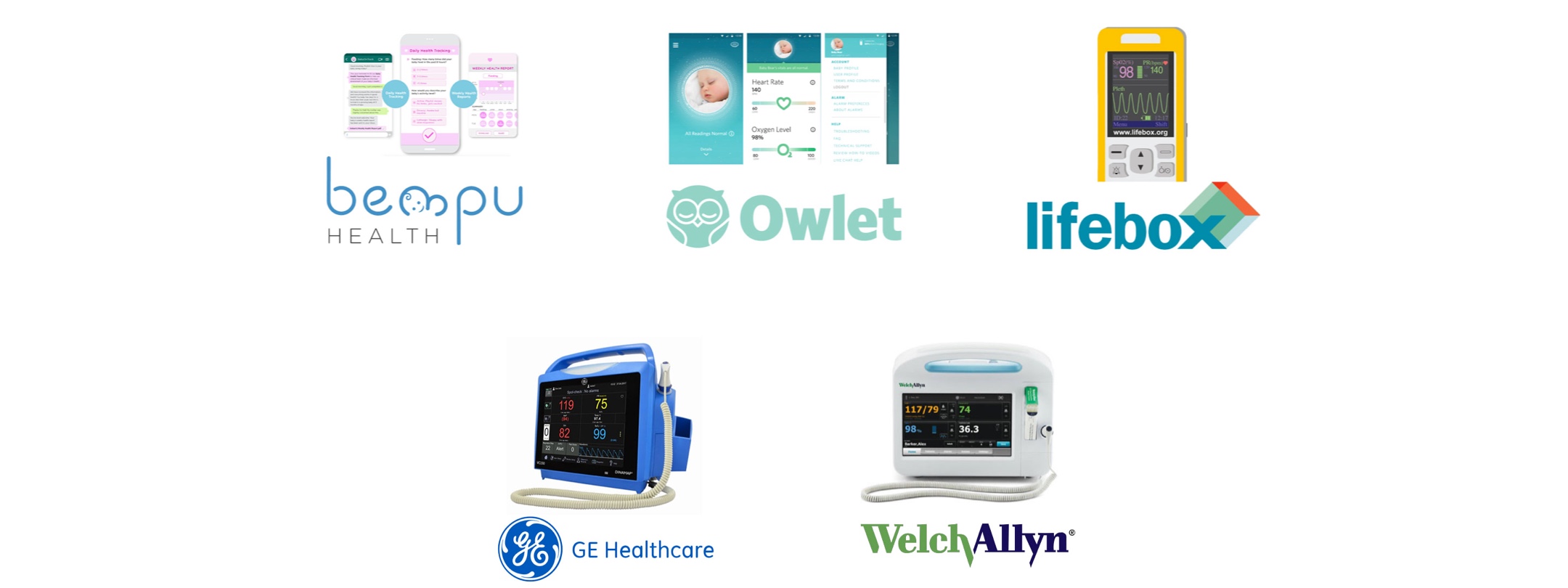
We conducted a visual competitive analysis to evaluate the strengths and shortcomings of five competitors.
Traditional vital machines tend to have a dark interface in order to create contrasting colors for important information.
Large, visible, sans-serif font is used to ensure readability from a distance.
With the information from the kick-off meeting and visual competitive analysis, we came up with three design principles:
Put the most important and pressing information in the most visible and prominent locations, expressing a clear hierarchy, ensuring color contrast accessibility, and reducing decision fatigue.
Our dashboard should make important information easily visible at a glance.
Use familiar patterns, language, and conventions that require minimal learning curves, assumptions, or onboarding to understand.
In this stage, I wanted to see our users’ perspectives on dark, light, and mixed interfaces, so I created three divergent style tiles accordingly. I created these style in portrait form to accommodate the methods we used for desirability testing.
In this design, I wanted to create a bright interface that is completely different from the traditional vital machines. I also re-designed the vital cards to make it easier to scan across. Additionally, I used colors to show the out-of-range vital signs: Red means higher vitals, while blue indicates lower vitals.
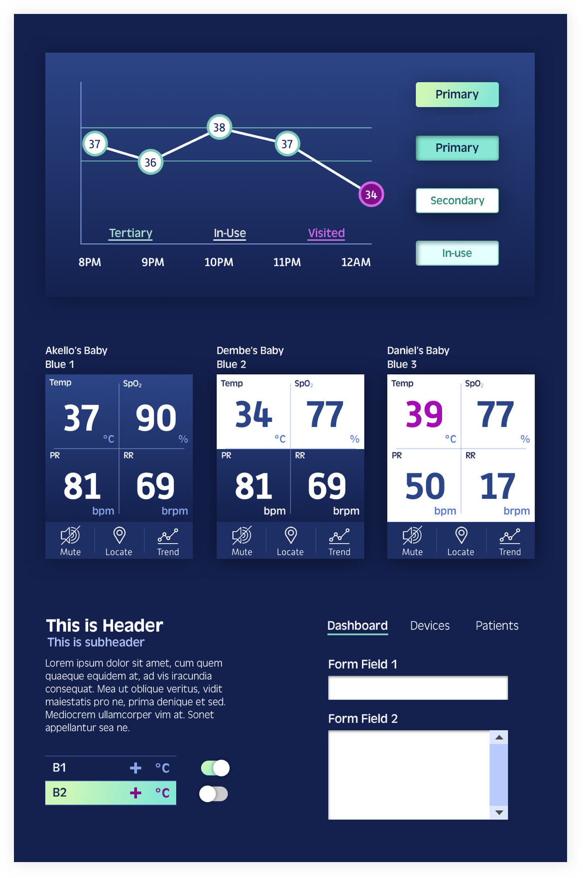
I also designed a dark interface with a slight gradient. To light up the dark interface, I used a bright gradient CTA buttons so that it doesn't look dull.
I used magenta to alert our users of any critical events to avoid alarm fatigue as mentioned before.
For the third design concept, I made a combination of dark and white interfaces, making the navigation dark and content white.
I tried to use icons to show the vital signs, as our users may want more cheering and playful vibes in a stressful environment. With icons, users also can tell the difference of PR from RR easily from afar.
As for the trend graph, I filled in colors and texture so that users can easily know what's going on of the baby in the history.
In total, my teammates and I tested 12 style tiles with each user. To alleviate users’ burden, we used “triading,” in which we showed 3 randomized style tiles on one screen each time for 4 rounds. Each user was tested with randomized style tiles to minimize the bias. Through this method, we were able to know what our users like and dislike and what works the best among different designs.
We recruited 3 Ugandan users, with the help of our client, and 4 US nurses, from our personal connections. All interviews were done remotely. The feedback was surprising.
Half of the users preferred the dark interface, and the other half preferred the light one.
Most of the users preferred the color usage of The Day and The Dawn because they could see what is important and what is not; while The Night does not have the strong hierarchy in terms of showing the emergency. Some users also pointed out that blue (on The Day) is not a good color to show emergency.
Dark interface is easy to the eye, especially during the night shift.
Light interface keeps me awake during the night shift.
Some users indicated that the horizontal display of vital signs is easier to scan, and they could compare the readings of a specific vital vertically.
Many users mentioned that the icons were too large on The Dawn. The vital readings should be the most important information and should be legible when being seen from afar.
It’s easier for me to scan across the readings than view the vitals in a square.
The icons are huge. I can’t even see the numbers.
Our users mentioned that my trend graphs didn’t have enough information, such as detailed units of x- and y-axis. Most of the users like the trend graph on The Dawn because the fill-in trend helped them to quickly track the time (x-axis) of the critical events, and the texture makes the critical event more prominent.
What are the units of the x-axis and y-axis? I need them to read the graph.
It’s easier to tell what time it is for each dot with the fill-in graph.
Based on the desirability testing, I decided to move forward with the combination of the designs of The Day and The Dawn because users felt that it's easy to digest the information of The Day and they could quickly find the data they need on the trend graph of The Dawn.
The combination is aligned with our design principles. The strong visual hierarchy helps users to track down the most important information quickly (Inverted The Pyramid). The new layout of the vital cards allows users to scan across the vital signs (Birds Eye View). Finally, the UI elements used for the design are conventional and users were able to quickly understand what they were (Don’t Reinvent The Wheel).
Before working on high-fidelity mockups, I evaluated the wireframes based on our research to further iterate the UX design and improve the usability. I made critical changes to the following elements:
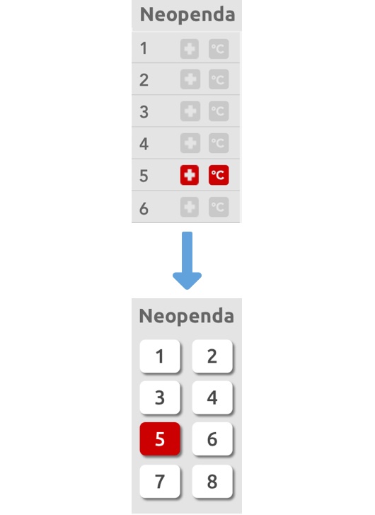
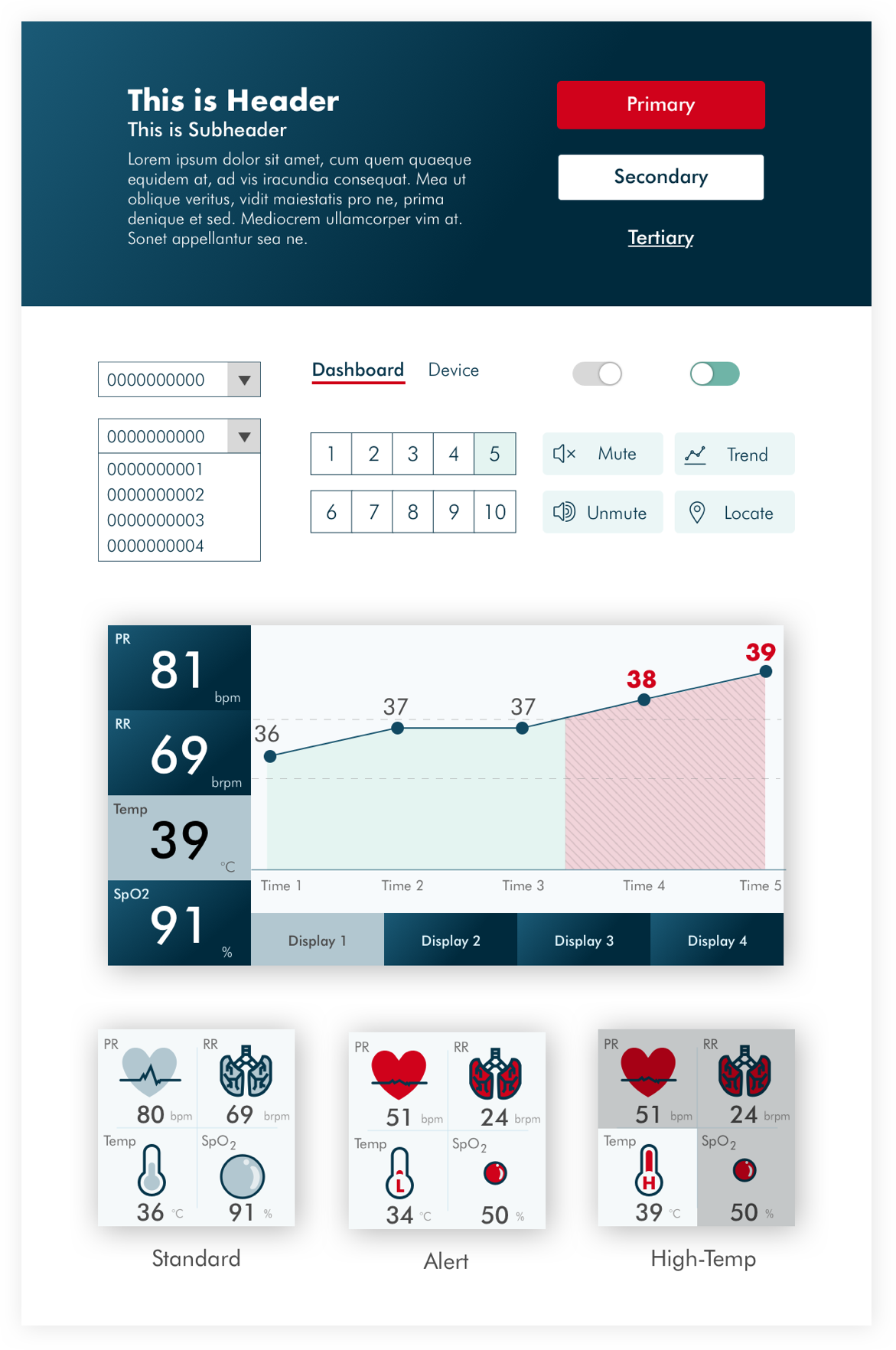
The functions of the side panel are 1) to quickly inform users if there is anything urgent and 2) to quickly refer to the corresponding vital card. However, the original wireframes did not achieve these functions completely because the list was not friendly to big fingers and the icons were confusing.
To solve the issues, I removed the icons and replaced the list with buttons, which are more friendly to big fingers. At the same time, I use the red button to indicate the emergency event of the corresponding baby in order to keep the alert function.
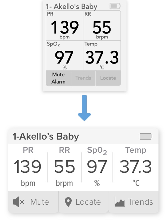
The vital cards provide real-time vital sign readings. However, the layout may not be intuitive to our users because users have to read the numbers in a Zigzag or circle around, which is not an effective way to read; especially, when there are many cards on the dashboard.
To increase legibility, I redesign the layout of the vital card so that all the readings are displayed horizontally. According to our users, this layout helped them scan across the numbers quickly and allowed them to compare the vital signs with other cards in the same column.
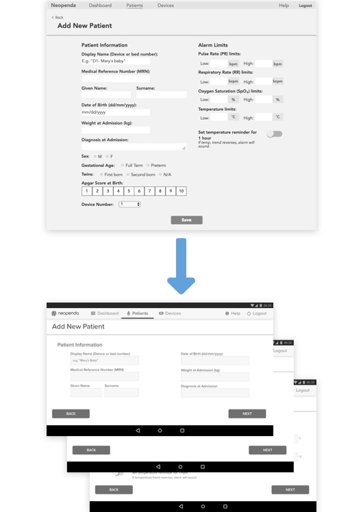
The new patient form allows users to input new patient information to add a new baby to the system. The original form was not easy to digest, and users need to redundantly input the same numbers every time for the "Alarm Limits" section.
To ease users' workload, I separated the form into three steps. Each step has a similar way to input (typing or tapping) so that users don’t need to switch around the input methods. Additionally, all the information is pre-filled with standard numbers on the alarm limits page because we don’t encourage our users to make any changes to the numbers unless there is any special need.
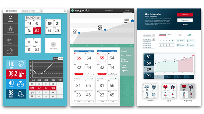
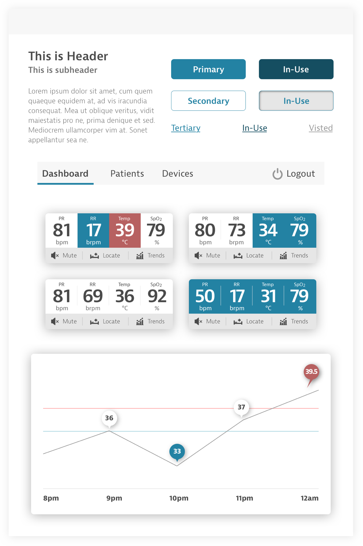
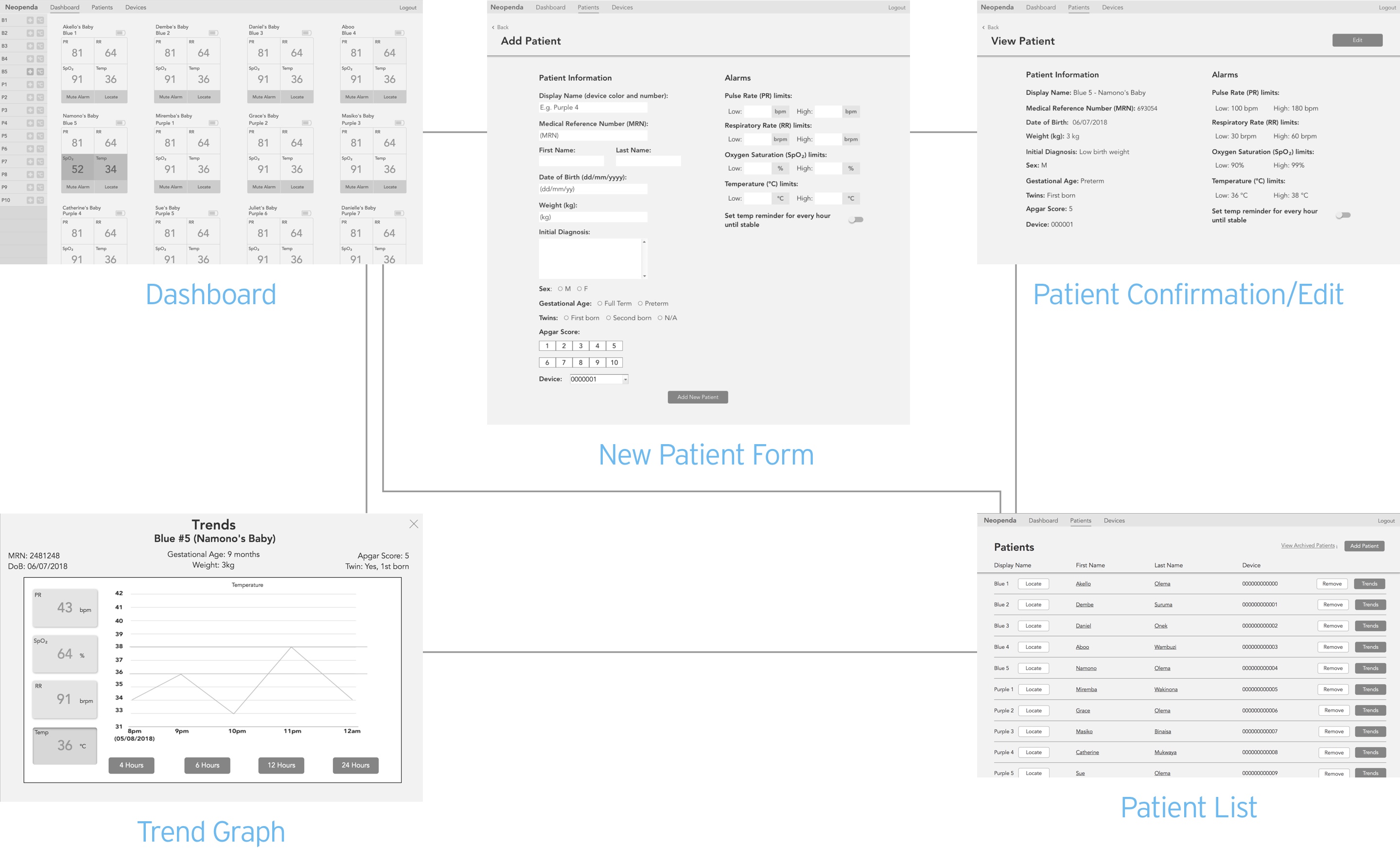
In this stage, I created high-fidelity mockups of the key screens — the dashboard in the resting state, the dashboard in the alert state, and the trend graph — and reviewed remotely with 2 Ugandan nurses, 1 US doctor, and 2 US nurses to get more insights on the refined design direction.
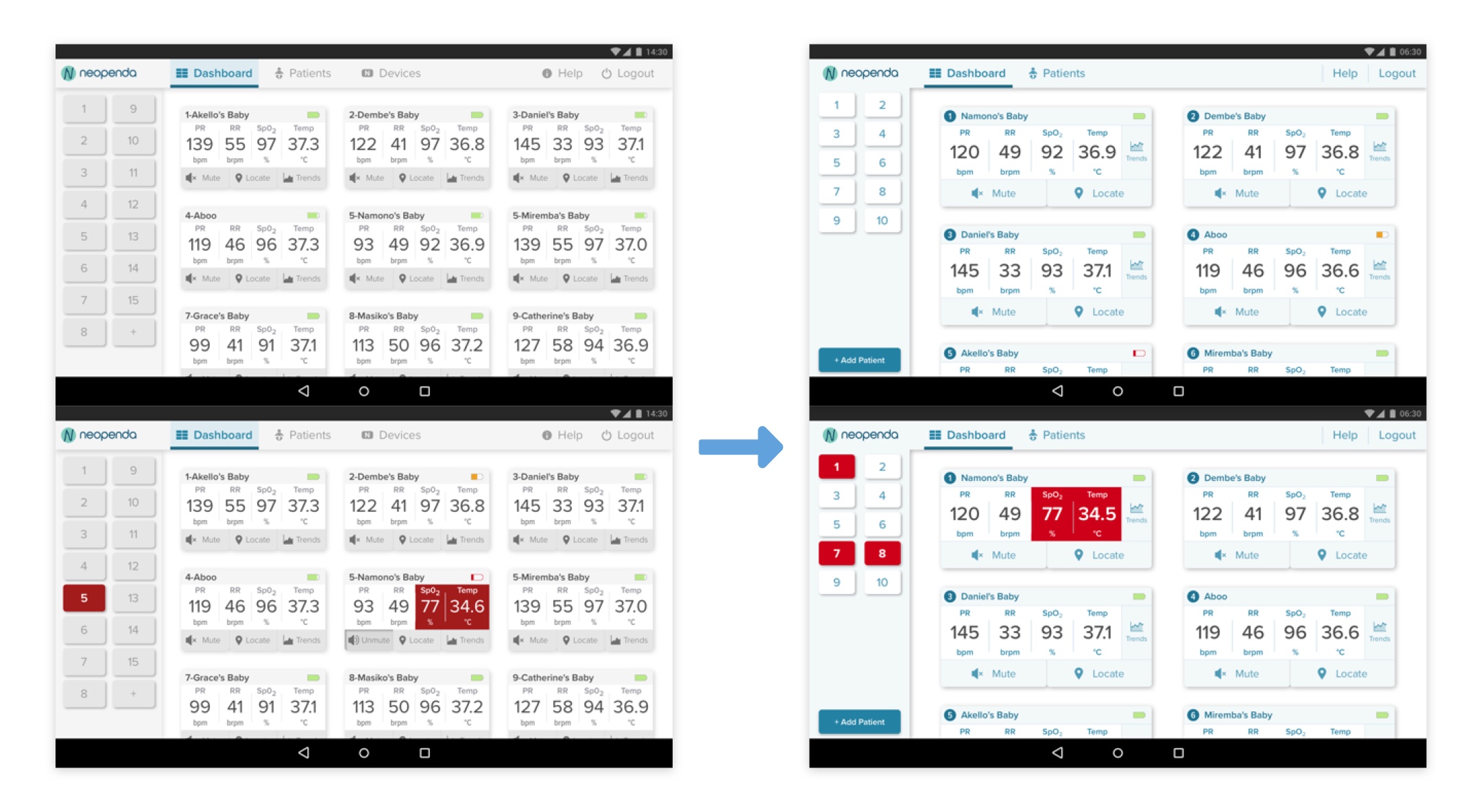
The dashboard is where users can have a glance at patients' vitals. When any critical event happens, the number on the side panel and the vital signs of the corresponding patient starts flashing, notifying the users that something's going wrong.
Users knew how the new side panel works instantly.
Users thought design was too white in the resting state, yet they noticed a strong contrast in the alert state.
Our users mentioned that the red was not “dangerous” enough in the alert state.
Some users thought that the numbers look very crowded and hard to read.
I applied light blue to the interface to make the interface not as white while keeping the high contrast.
I made the red more vibrant to show urgency.
I made the vital cards larger, giving the numbers more breathing room.
I rearranged the buttons of the vital cards, making mute and locate buttons the most prominent since they were the most used buttons during the user testing. The trends button was placed on the very right, aligned with the vitals because it's supposed to provide more information about the vitals.
The trend graph helps users track down critical events and also helps them better communicate during shift transition.
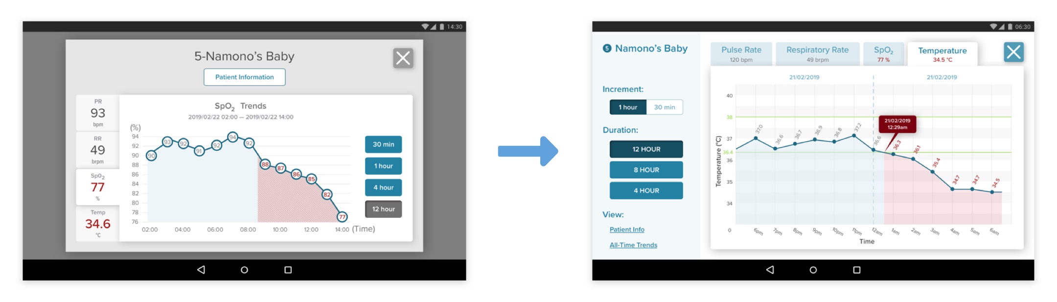
Our users found the fill-in colors helpful to track back to the x-axis.
Users wanted to see bigger graphs.
Users wanted to see the standard range of each vital, detailed time of critical events, and the date, which helps them better communicate during work shift transition.
Used full-screen to show a larger graph.
Added a call-out box to indicate the start time of the critical event.
Added vertical lines to help users track back to x- abd y- axis.
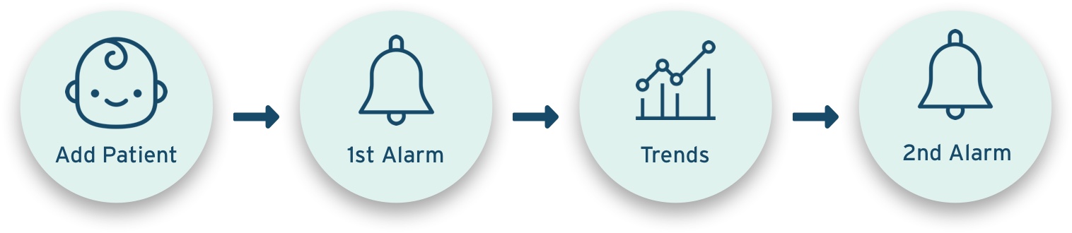
Based on the feedback, I kept iterating and created more screens for usability testing, and then conducted usability tests with 5 US medical professionals remotely. I asked users to complete a task flow (as shown in the image below) within a given scenario. By doing so, we were able to know if our visual design makes the user experience work in the way it's supposed to be.
I prototyped my design with Framer X and Principle for user testing and the final deliverable, respectively. Framer X provides the option to export the prototype as a web page, which is easier for remote testing, whereas Principle allowed me to create more microinteractions for the prototype.
The following walkthrough was done and filmed with Principle.
The dashboard displays all the vital cards of connected monitors. The side panel gives an overview of the current status of babies. If something goes wrong, the button of the corresponding baby will turn red. Users can tap the button, which will bring them (auto-scroll) to the vital cards of the baby who is in a critical event.

By hitting the "Add Patient" button, users are prompt to the 3-step form. Each step has a similar way to input data, which reduces the time of switching input methods.
On step 3, alarm limits, all the form fields were pre-filled with standard ranges, so that users don't need to fill in the same numbers every time unless they want a customized range. If users change anything on the Alarm Limits form, a pop-up will ask them if the changes were made intentionally. By doing so, we can minimize human errors.
After completing the form, users can quickly scan through the information, and make changes to the individual step if needed. Once users hit the confirm button, they will be led to the patient list page, where they can see the newly added patient highlighted along with other patients on the list.

There are situations when our users have to leave the dashboard and work on other things with the app. Therefore, I introduced the notification to the system. If something urgent happens and our users are not on the dashboard screen, a big, red pop-up notification bar with patient number and name slides out from the right with a beeping sound, notifying users that something's going wrong. Users can tap the notification, which will bring them back to the dashboard with the vital card of the baby in emergency highlighted.

Users can check the history of vital signs on "Trends." They can view alarm history and trend graphs. On the trend graph, the red-shaded area indicates a critical event. Users can tape the button to see the detailed information of the event. They can also view the graphs in different increments or durations.

If you're interested in trying the prototype, please check out the one I made with Framer X. This is the prototype I used for the user testing, so you may want to follow the user task flow.
I created a 40-page style guide for future designers and developers to build an interface that is consistent with my design. I specifically included the rules and mechanisms of microinteractions to ensure that our users have good experiences in every interaction with the interface.
Future developers need to consider the timeline for the mute buttons because the medical treatments for different situations may not instantly work to make the vitals back to normal. Think about how to define the timeline for each emergency event to effectively alert the users without overwhelming them.
Future developers or designers need to figure out how to make sure that the mute button is used only after the users have checked the baby in need.
The content of the new patient form needs to be tested by Ugandan nurses as the procedure may be different in Uganda than in the US.
Give users the capability to customize the interface, such as the preset alarm limits, the length of mute, and colors (for accessibility), etc.
It was a fruitful project that I got to polish my skills and learned something new. I was able to create a visual system that helps users quickly adapt to the interface without even noticing. Additionally, I tried my best to create a detailed style guide that helps future developers build an interface that is close to my design. Finally, I stepped out of my comfort zone and explored other prototyping tools to meet the needs of my clients and users.
With that, I still have something to improve on in the future. Because of the time constraint, we weren’t able to recruit enough Ugandan nurses for user testings. Next time, I would try to recruit new users ahead of time; especially, for the users that are in different countries and need to interview remotely.
All in all, it was a great experience working with the client and my teammates. Through this project, I will potentially save millions of lives in Uganda and make an impact on this world.