Role: UI Designer
Duration: 6 weeks
Platform: iPhone 8
Tools: Sketch, Principle, Illustrator, Keynote
Vente is an event-exploring mobile app that helps users find nearby events/activities based on their preferences. My goal was to design an iPhone interface for busy millennials who are eager to find fun events around them instantly.
Today's users are overwhelmed by local events, meet-ups, and group activites because of an overload of shareable information. Without a good tool, people struggle to find activities that align with their interests.
Through competitive analysis, I was able to understand the visual patterns of the competitors as well as getting inspired by their designs. I looked into six competitors, including Eventbrite, Do312, built in Chicago, Facebook, Eventzilla, and Meetup.
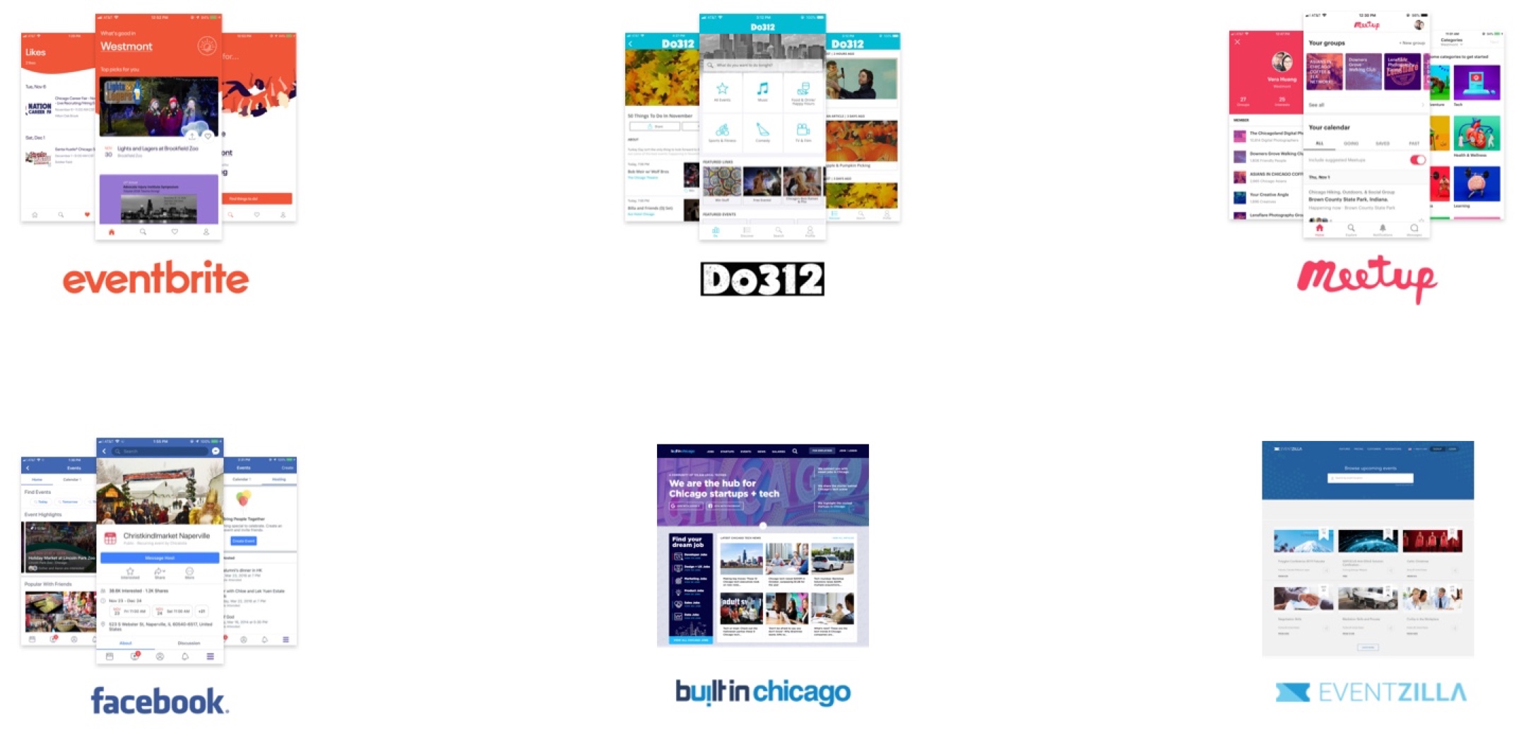
The use of cards, tiles, list, filter, and accordions helps users digest a large amount of information.
Most of the competitors used Sans-Serif fonts to make the content more legible.
Users should be able to complete a task with as few steps as possible.
The visual hierarchy should help users get the information needed instantly.
Create an interface that is cheering, supportive, and encouraging to our users.
In order to explore the possibilities of the logo designs, I came up with some relevant words that best describe Vente. With that, I sketched out as many ideas as possible.
I worked closely with the creative directors and picked a few logos for digitalization.
I finally decided to go for the following logo because it represents the brand the best. This logo is composed of an escalator and a vertical bar as a person. The service Vente provides is to lift up users to an upper level of happiness through helping them find events of their interests.
This design is my final direction because it meets user needs and the brand values the most.
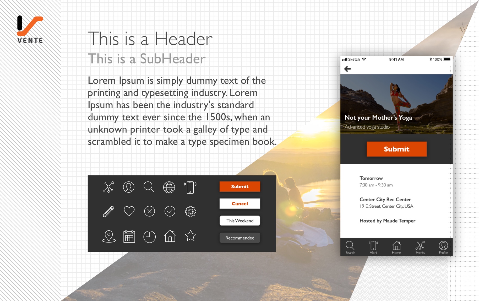
I used orange color and uplifting imaginary to cheer up users. The use of lines and girds makes the design more light-weighted. With this design, I want to motivate users to go for events of their interests.
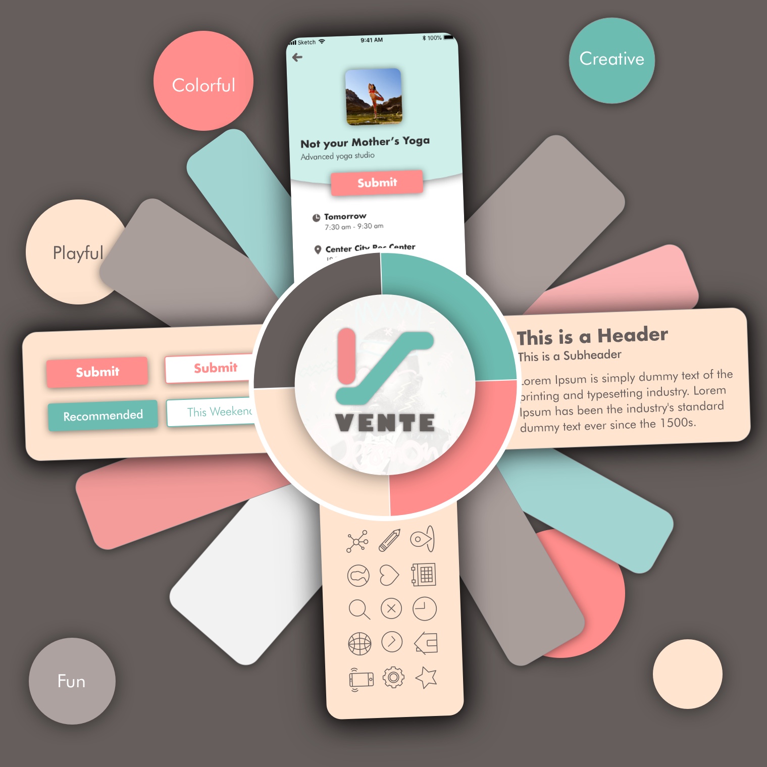
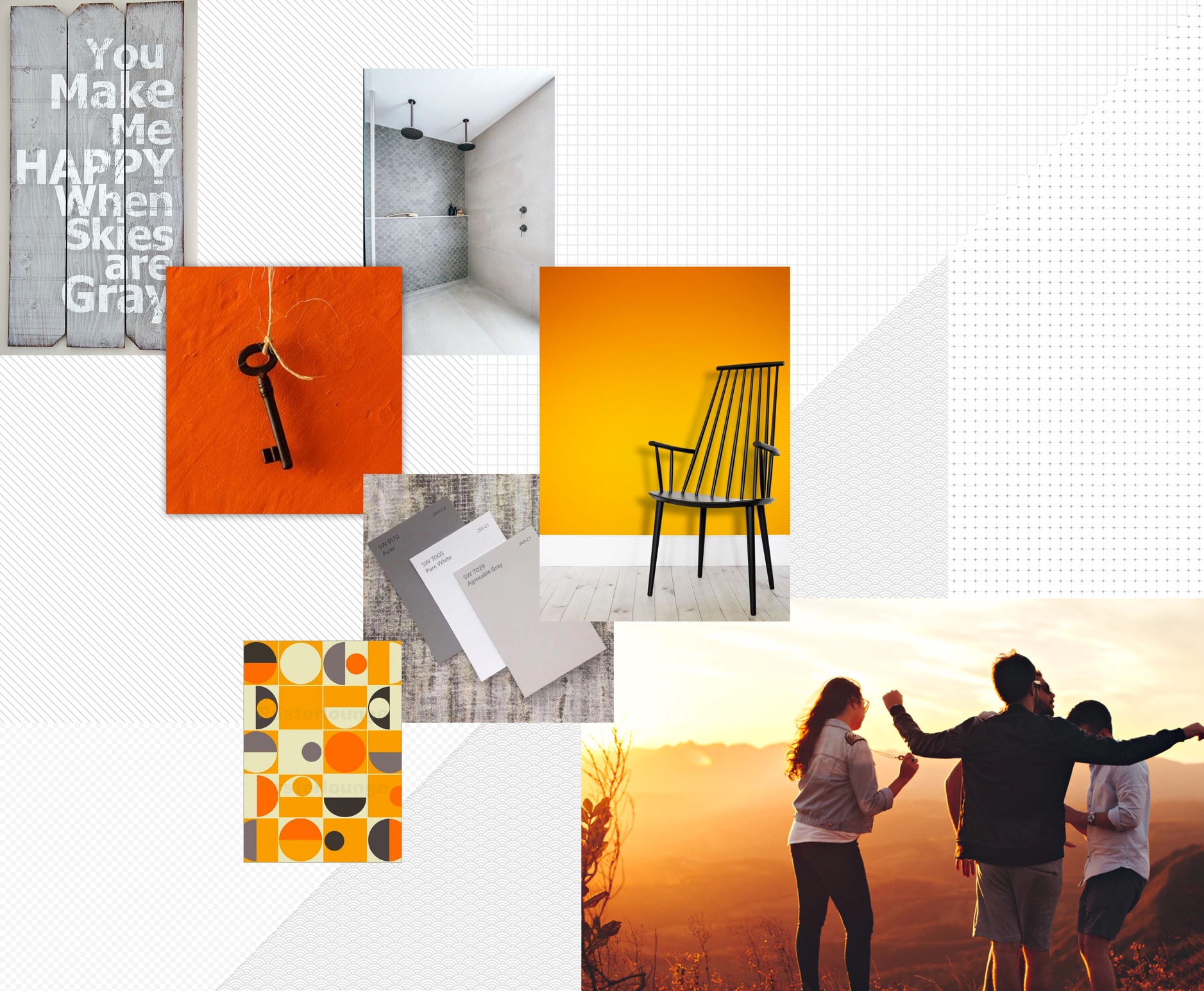
In this design, I used pastel color combinations to create a young and fun vibe. The use of scribbles, circles, and random organization of information makes it more playful and mischievous.
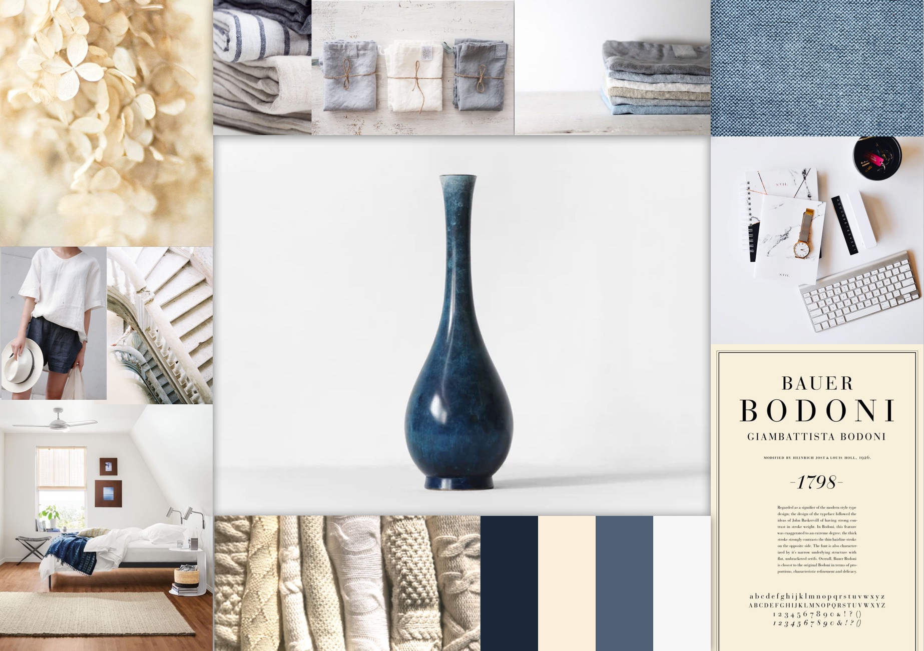
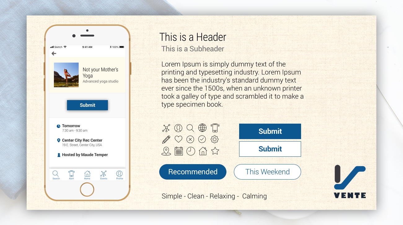
I use a lot of linen texture and earthy colors to make users feel like home. The primary color, navy, added a little calmness to the design. Altogether, I created a style that makes users feel relaxed.
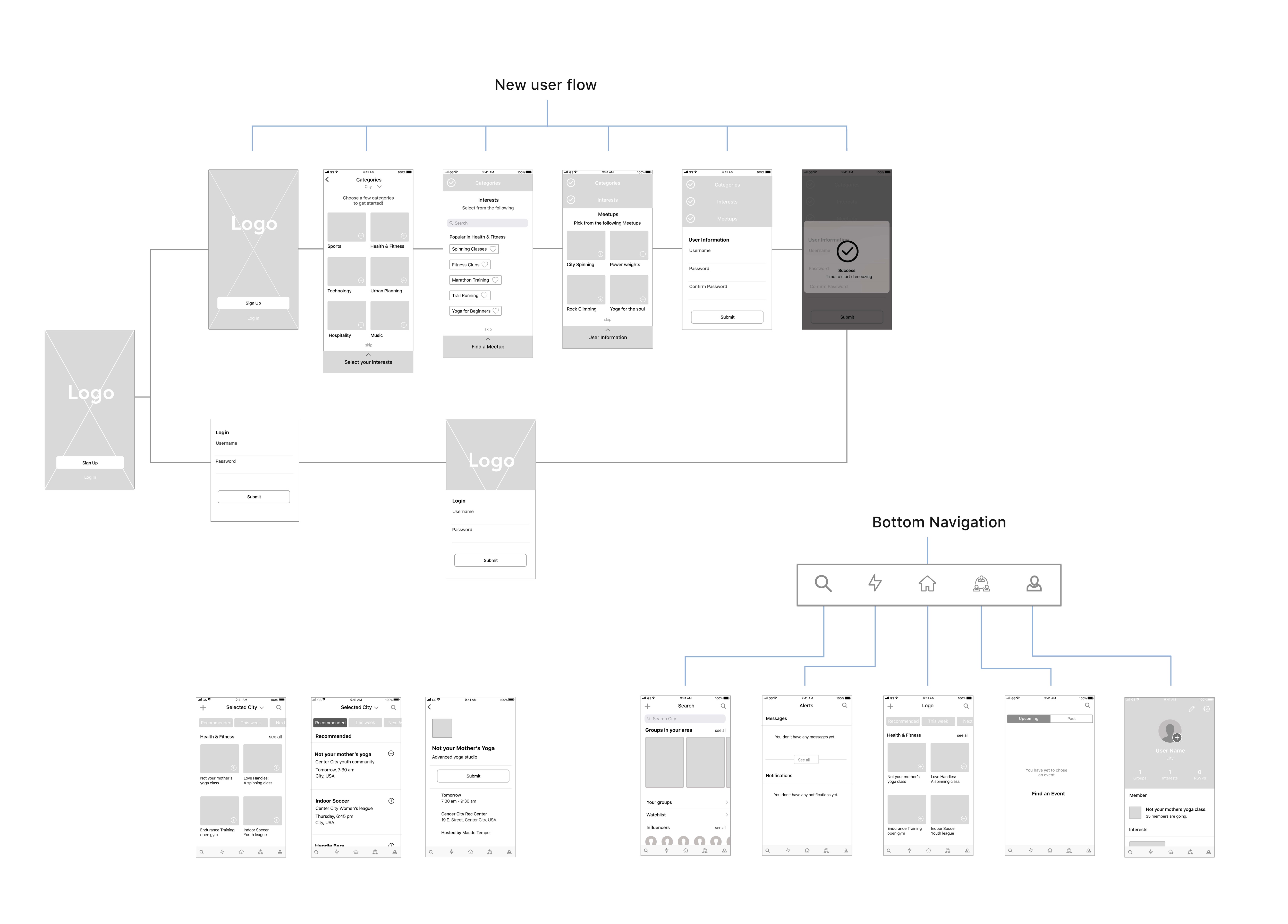
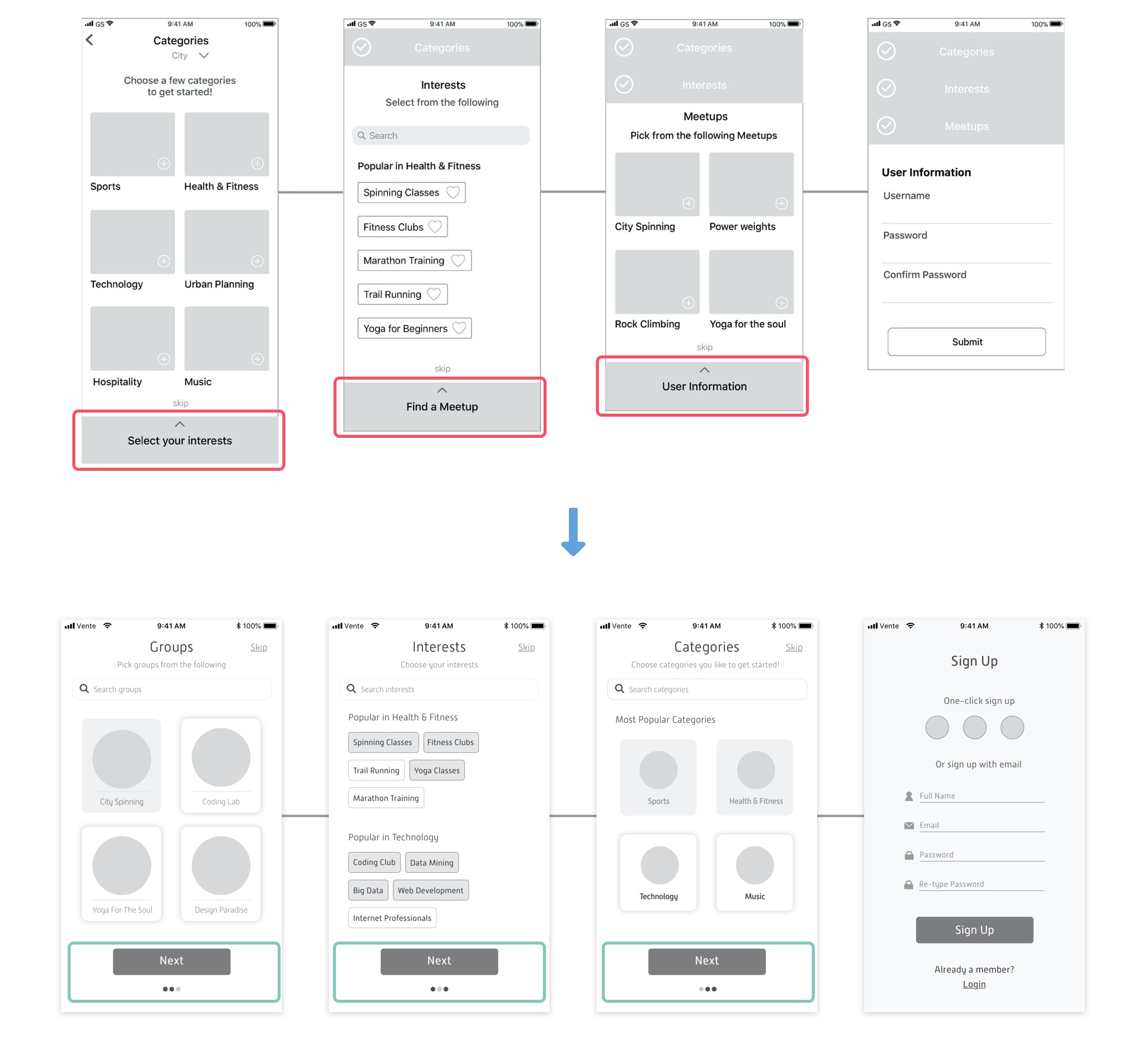
There is no "next" button for the onboarding process. Instead, the UX team used the accordion for the process, which is not very common. Additionally, there was no indicator of how many steps there are on the screen, which may make users leave the app.
In my design, I removed the accordion and added the next buttons. By adding the indicator dots at the bottom, users can anticipate how many more steps they need to go through to finish the sign-up process.

There is no label for each icon, and some of the icons are not as conventional, for example, the lightning and the three people icon.
I changed the icons and added a label to each of them.
After I created hi-fidelity mockups and prototype, I tested the Vente app remotely with three users of different life stages. I used Zoom and Proto.io (account expired) to complete the task.
Most participants indicated that the design is simple/ simplistic/ streamlined, nice, easy to use, modern, and friendly, which match our brand identity.
The text is easy to read.
They were able to find the CTA quickly, and know the bookmark (save it for later) function right away.
All in all, users were able to guide into the app without help, and the visual design does strengthen the function of the app, and did not cause any distraction.
The RSVP button is a bit confusing.
Some of the text buttons are not visible enough.
The prototyping tool is a bit glitchy, and users found it challenging to use it smoothly.
Vente is an event-exploring app that helps users find events of their interests. It is composed of two parts: The onboarding process for first-time users and the in-app.
The onboarding process helps users customize a list of events that are aligned with their interests. We want to make this process as simple and quick as possible to ensure that our users would complete the process.

This app optimizes the list of events and activities based on users' preferences (Home). It allows users to save (bookmark) events for later (Home, Event Info, Saved Event) and RSVP the event they want to go directly (Event Info, RSVP'd Events). The search function allows users to search for events that are not on their lists. If needed, users can also send direct messages to the event hosts (Messages).

To ensure that future designers and developers follow the style while developing the app, I created a style guide for Vente. This guideline depicts the rules and patterns of UI element usage, such as the use of icons, logo, colors, typography, and images.
As a group of nine UI designers, we had group critique sessions twice a week, which is my first project that involves peer critique sessions. During the meeting, we gave feedback to each other and then iterated on the feedback afterward. With many eyes on my design, I found my work much better in the newer version every single time. My design skills also improved dramatically every time I got hurt and rebuilt my confidence along the way.