


UIUX Designer, Front-end Developer
Sketch, Framer X, Illustrator, Powerpoint, Dreamweaver
Lung Decision Coaching Tool (LDCT) is a website designed for Chinese seniors who are current or former smokers. The tool was designed according to an official booklet published by the American Lung Association. I worked closely with Professor Chien-Ching Li from Rush University Medical Center to design and develop a culturally appropriate tool that helps Chinese seniors learn about lung cancer, lung cancer screening, and eligibility for lung cancer screening.
Chinese elderly who are former or current smokers need a tool to help them understand the basic knowledge of lung cancer, preventive screening, and insurance coverage. However, there was no website providing the information in the language they could comprehend, nor were there websites designed to cater to their internet-using behaviors.
The goal of this project is to create a culturally appropriate website to educate Chinese elderly about lung cancer, preventive screening, insurance coverage, and more.
I spoke to three Chinese elderlies who currently or previously smoked.
I asked them some questions:
Have you ever searched for information about lung cancer, lung cancer screening, and/or other related topics? What kind of devices did you use? Did you encounter any difficulties during the process? What websites did you visit, and how was your experience? How often do you visit websites in general? How do you get links to the websites? What devices do you dislike/like the most when visiting websites?
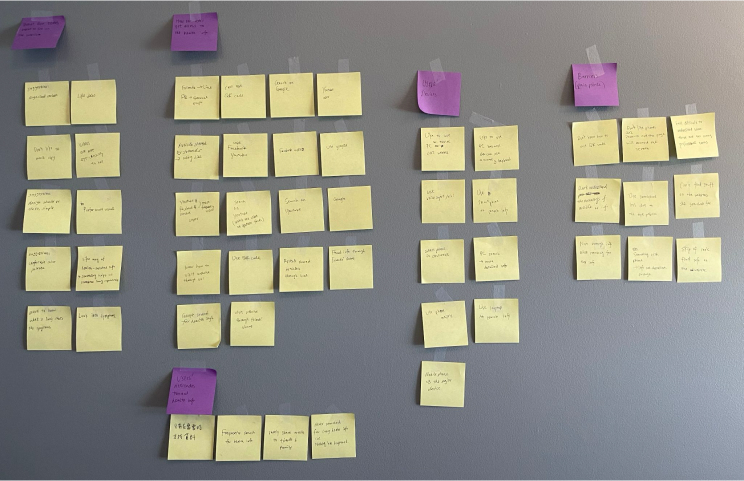
After that, I used affinity mapping to find out users' pain points and their behaviors.
Convenience
Don't know how to use a PC
Voice input available
Keyboard and mouse available
Bigger screen and easier to read detailed information
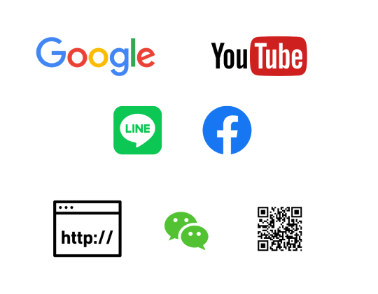
All users had experience searching on Google and watching videos on YouTube. Some of them knew how to use QR codes to access health information.
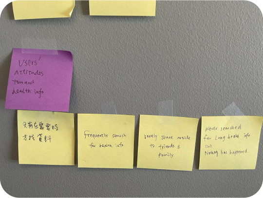
Most of the health-related information they received was shared by their friends in China or Taiwan. However, they didn't share the information that frequently.
Most users didn't proactively search for health-related information until they or their friends/family had health issues. Additionally, they rarely shared health-related information with friends/family. Only one of the users read health-related info frequently.
Need to zoom in and out to read
Don't know how to use QR codes
Not enough information when viewing websites on phone
Difficult to understand the content
Couldn't find the information they want to learn
Organized
Clean and simple
Colors that are easy to the eye
More visuals, less text
Include videos
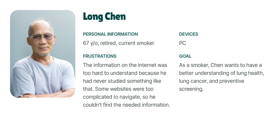
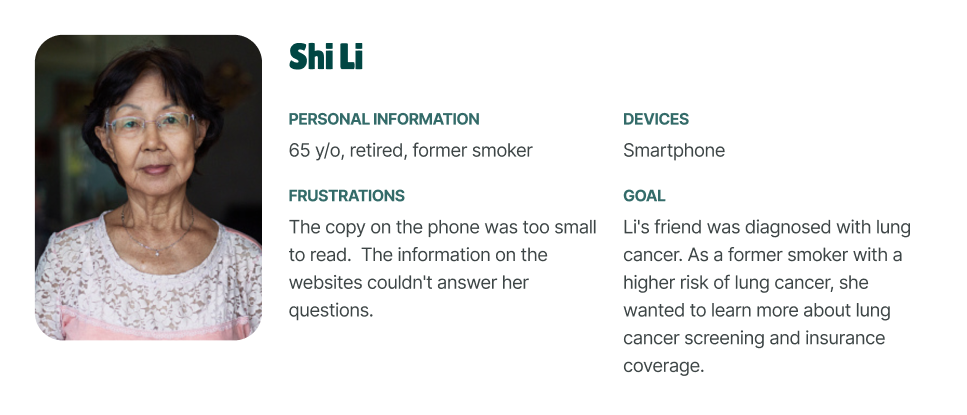
Meet Chen and Li, the Chinese elderlies who are current and former smokers.
I looked into three competitors to analyze their design patterns and five other websites targeting seniors for inspiration.
You can view the complete analysis here.
Takeaways:
Icons were rarely used on websites targeting senior populations. The hamburger menu was also seldom used on these websites unless it was on mobile.
Most senior targeting websites look traditional and outdated. Big font size and strong visual hierarchy are extremely important to help our target users read.
Considering that a lot of our users use mobile to access health-related information, I followed the mobile-first design process. The desktop versions were created based on the mobile version.
Once on the mobile site, users are exposed to a landing page with a video about lung cancer and a list of web pages they can visit. In this idea, I want to show what information they can learn from the website and let the users choose whatever they want to view.
Big text over an image as the hero banner
Sticky menu (選單) at the bottom of the page as the users enter any of the pages
Use of cards to better organize information
As for the desktop view, users are introduced to a landing page with the same video in fullscreen mode.
All the navigation items are visible to the users
Big text over an image as the hero banner to catch users' attention
Sticky nav at the bottom of the page to ensure a seamless experience between desktop and mobile versions.
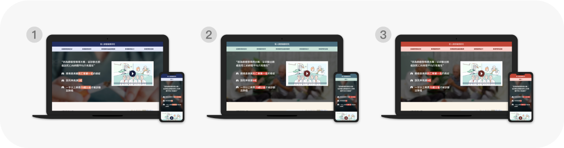
Idea #2 has a conventional design of the hamburger menu, which has become well-known among older users.
A video as the hero banner for each page to catch users' attention
Avoid text over images for better legibility
As for the desktop view, users are introduced to a landing page with the same video in fullscreen mode. The site navigation is at the bottom of the page to ensure a seamless experience between desktop and mobile sites.
A drop-down menu item to house more page items while keeping the navigation bar clean
Similar navigation and page layout to ensure a seamless experience between mobile and desktop
I conducted another round of user testing with three other users using the lo-fi prototypes I created.
Users were confused about the navigation in idea #1. Most users are more familiar with navigation at the top of the page.
The fullscreen video as the hero banner in idea #2 stops users from scrolling up/down.
Users loved the big text over the images as the hero banners because they made them want to learn more about the topic.
Users loved to see all the available pages on the menu.
A CTA button at the bottom of the page helped users navigation to the next topic.
Hamburger menu with a clear label of "選單" at the top of the page
All the menu items were listed with no collapsible item
Big text over the image as the hero banner to catch users' eyes
"Previous" and "Next" CTAs were added to each page to help navigate users through the website
All the menu items are visible to users
Videos were incorporated into the hero banner
As the project progressed, Dr. Li asked a video team to make educational videos for the website. I wanted to ensure the website design was consistent with the video style. Therefore, I used the same design layout with different color palettes for the desirability test. The color palettes were inspired by the competitive analysis.
I conducted the test through emails with three new Chinese seniors who were current or former smokers. I asked them to rank the color palettes based on their preferences and how easy they were to the eye.
Finally, color palette #2 was popular among the users.
I implemented the colors to both mobile and desktop wireframes with some tweaks to make sure that the design follows our users' preferences and caters to their behaviors.
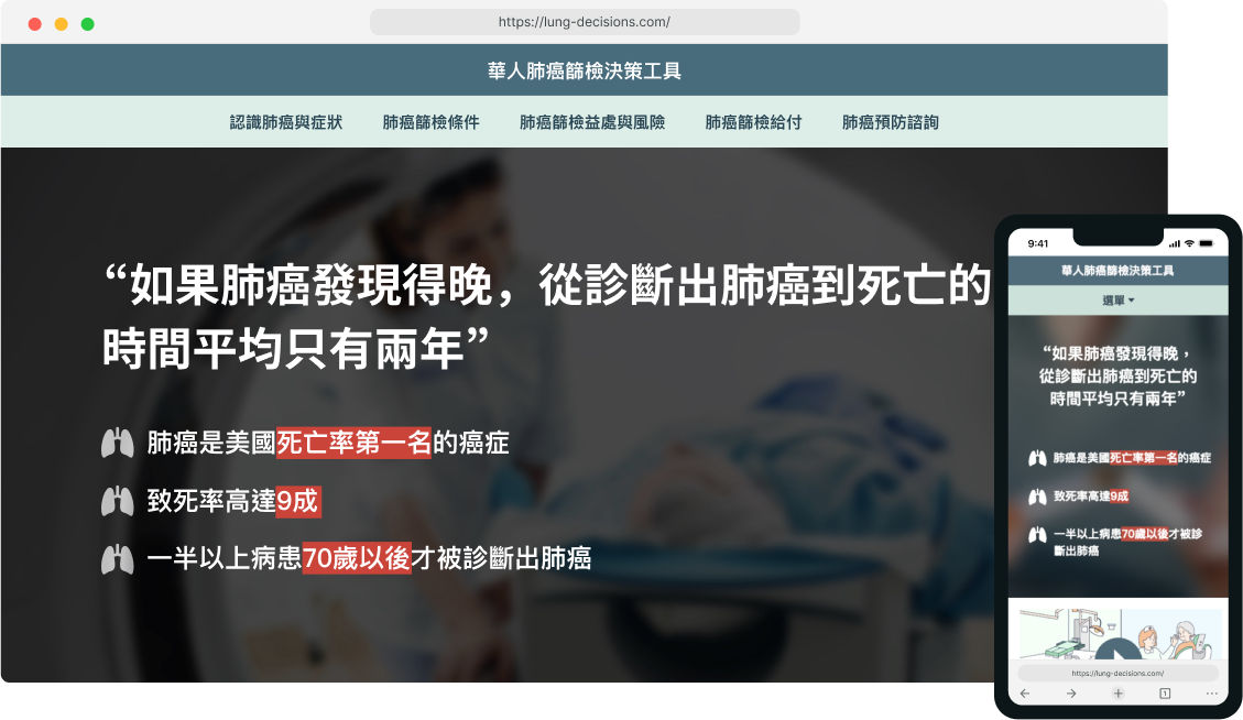
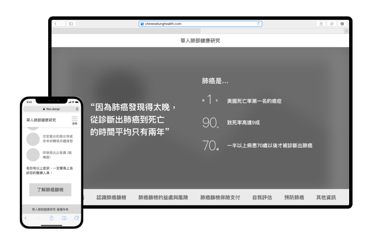
In mobile view, I adjusted the font sizes to ensure legibility for seniors. The hamburger menu was labeled with "menu" to help users navigate. At the bottom of the page, users can jump to other pages through the sticky navigation, and footer links, or just follow the "previous" and "next buttons" to read the topics step by step.
Users can easily navigate through the website because all the nav items are visible. The icons and photos help balance the content/visual ratio and make the pages look less overwhelming. The infographics also help users understand the content.
I developed the website using Dreamweaver. Some adjustments were made to cater to the new needs.
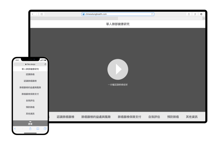
The live site can be found here.
Language buttons were added to the video section, so I moved the video down to avoid crowded hero banners.
Users mentioned that they didn't know what page they were on when visiting the website, so I exaggerated the on-state of the nav items.